window painting

I was commissioned to create a temporary painted window for The Lovely Clinic in Knightsbridge, while their renovations are happening.

I created a window design with a hand-drawn version of their logo and name, with an illustration of one of their laser machines. I added sparkles and wording and a little cheeky speech bubble.

I drew the design in black line first, doing all the lettering backwards, as I worked on the inside of the window.

I then painted from the front to the back, layering the colours to create as even and flat a layer of colour as I could.

The clinic will have its shutters down behind the window while they are renovating, so my painting will serve as a notice of what’s opening soon.

If you happen to walk past, let me know what you think, and do send a photo!
London

It has been an extremely chilly and frosty start to the year in London. I don’t remember it ever going down to -5C here before. I’ve been trying to capture some of the beautiful frost, lining all the vegetation in the mornings…

Getting up close you can really see the ice crystals forming over the different textures.

The garden is bare at this time of year, but the frost does make it seem sort of magical.

Happy New Year!

I hope everyone’s year is starting out well! I’ve just come back from Brussels where I visited my friend Aude and spent the weekend working in her studio on a Mokuhanga Sisters project.

All 9 of us in the group worked in our own timezones across 6 countries over the weekend to carve a snake/moon image and print an editon of 25 postcard-sized prints.

I started by sketching a variety of snakes, then decided to create a snake and moon vase, working out if it should be a red vase on white, or a white vase on red.

I added some floral elements into the design, and then simplified it as much as possible to be able to carve it in one day.

I carved 2 blocks, the gold highlight block, which I printed first, and the red vase block.

All of us used the same red sumi ink from Nara, so that all our prints would match. We could add one extra colour, so I added an ochrey gold to the moon and added some gold shading inside the vase and in the pattern of the snake.

I printed the edition of 25 cards, and will add my chop when everything is properly dry!

It was a great experiment, and fun to know that the other Sisters were also printing, all around the world.

London Christmas

I’ve been in London this week, visiting family, celebrating Christmas, and even managing some sightseeing in town. I do love looking at the Christmas decorations and lights all over the city…

Happy Christmas!

Wishing you all a very wonderful holiday season with family and friends!

I based this little robin on the two who live in my parents’ garden. They each have their own corner, and would visit to say hello when I was staying in London over the summer. I tried to capture their little hopping motions and the way they suddenly switch from facing left to right. They’re friendly and so curious about everything…

ceramic products in HK

There is a wonderful feature about my ceramics in HK based Japanese language lifestyle magazine Hong Kong LEI this week. The editor and writer visited the faux showroom while I was in HK and we had a long chat. A full interview with me will be published in the new year.

The article is written in Japanese, but your browser can translate it to English (as above).

Hong Kong Toile nails

While I was in HK last week, I went to my lovely nail lady who painted these delightful patterns based on my newest HKtoile design.

She is really a marvel! We work together to decide which part of the pattern should go on which nail, but she is the one who replicates my lines at such tiny scale!

It’s always a lovely treat to get my nails done in HK…

New York Times article

A journalist for the New York Times contacted me a while ago, to ask if she could interview me for a pice she was writing about custom art. She had received a wedding favour at a friend’s wedding that was a ceramic cup with one of my customised designs on it, and had always remembered it.

It’s just a little quote, but it gave me thrill to be featured in the New York Times! They showed this pretty wedding illustration that I was commissioned to create…

These are the original cups that the journalist remembered, for a client of mine who got married in Hong Kong…

And this is a one-off piece that I was commissioned to create for my friends Ming and Wah. I spoke about it at length, but it was cut from the interview! It shows each of their families, and hobbies, and the things that they like. It’a based on a famous 1930’s Chinese advertising poster.

I love making these custom pieces, and do feel they are an ultra special gift for someone you love.

mokuhanga exhibition in Japan

I was invited by the artist Erico Fujita to participate in a group project with Narushima Washi, who wanted to promote their Japanese paper. Each artist was asked to create any sort of artwork with their paper, with the results to be shown in a large group exhibition.

The works are all currently on show in Hanamaki City Culture Hall, in Iwate, Japan.

I created a variable edition of mokuhanga prints - an edition of 12, with each of the flowers having a different pattern or colour. I sent 4 to be shown in the exhibition. I really wanted to showcase the paper itself, so I left a lot of negative space around the flower.

It has been wonderful to see photos of people visiting the shows, and I enjoyed taking part in a presentation with some of the artists via zoom.

There are so many different types of artworks, I wish I could’ve visited the show in person to take a look.

This is the poster for the project which lists all the participating artists.

It’s always lovely to see my work in a new context. Do let me know if you make it to the show!

a San Francisco saturday

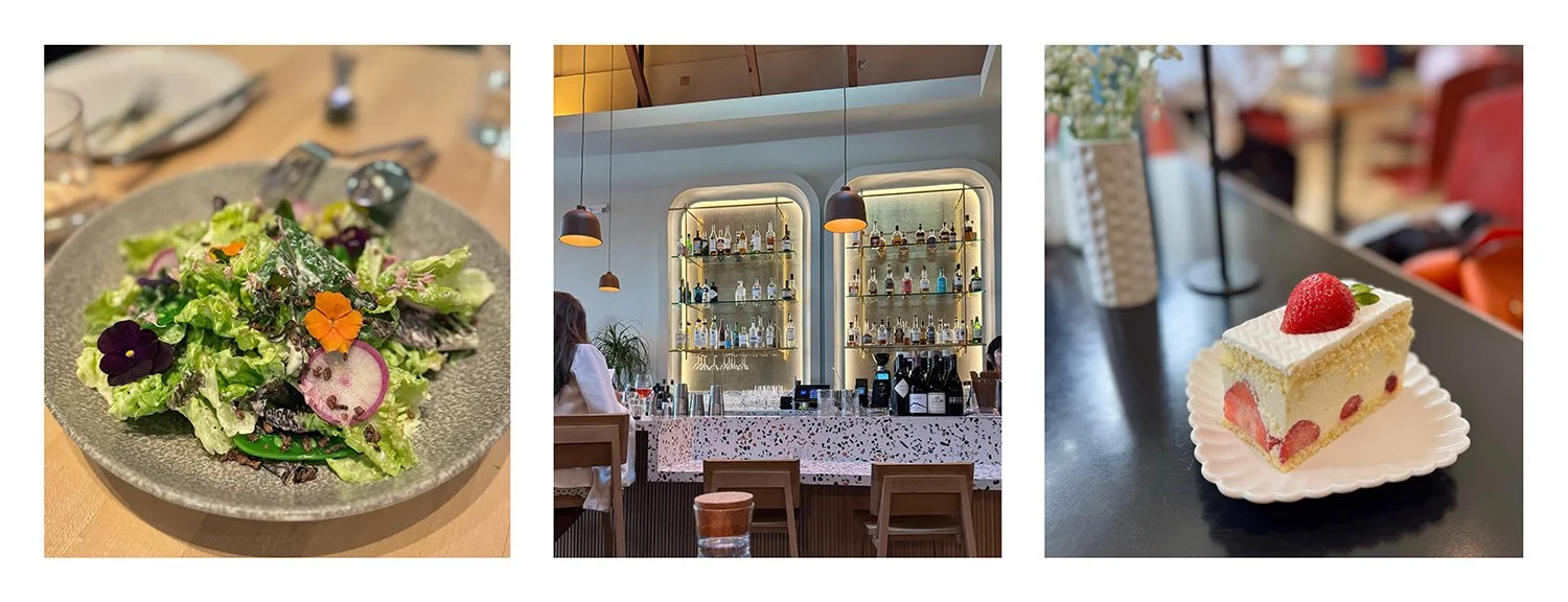
We had a lovely day in San Francisco today, starting with a delightful brunch tasting menu at the now Michelin star restaurant Hilda and Jesse in North Beach. Each course was a feast for the eyes, as well as the tastebuds. Somehow if the colours around you as you eat are pleasing, everything is just so much better.

We then went to see the group show at STUDIO Gallery SF, where I had some prints. Both the prints that I had framed on the wall had been sold, but they’ll replace them with my peony mokuhanga print so fingers crossed that sells too.

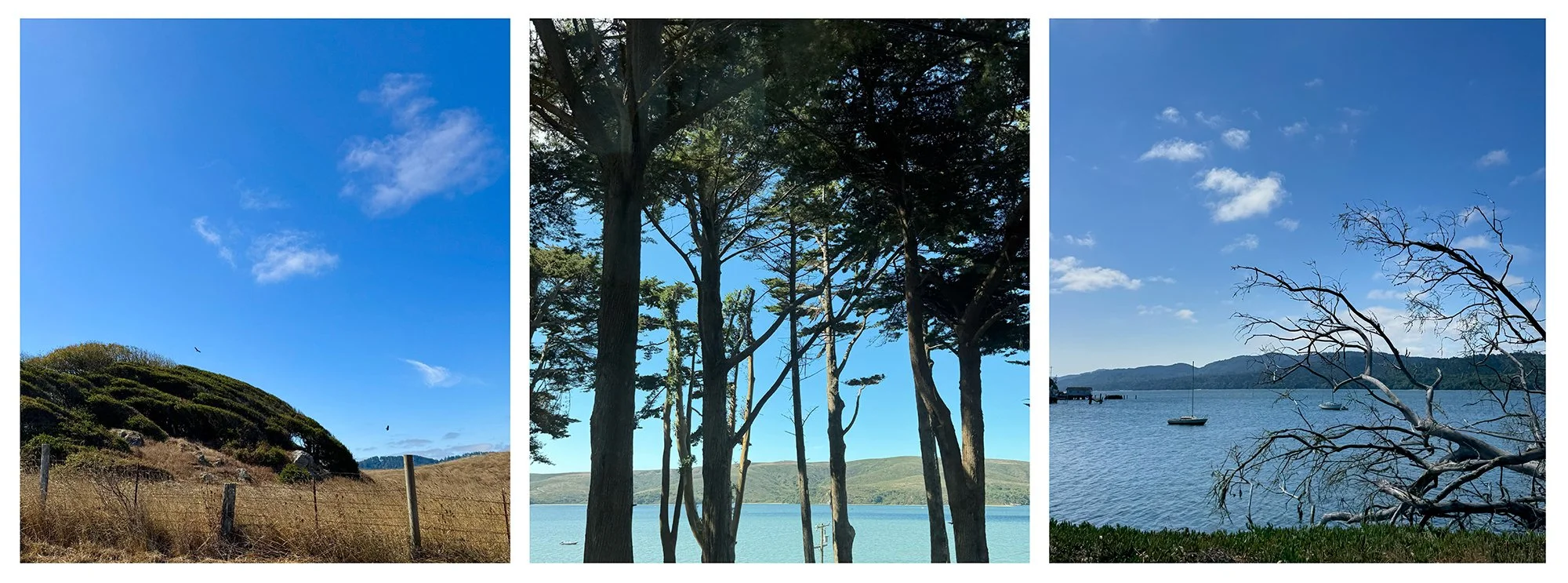
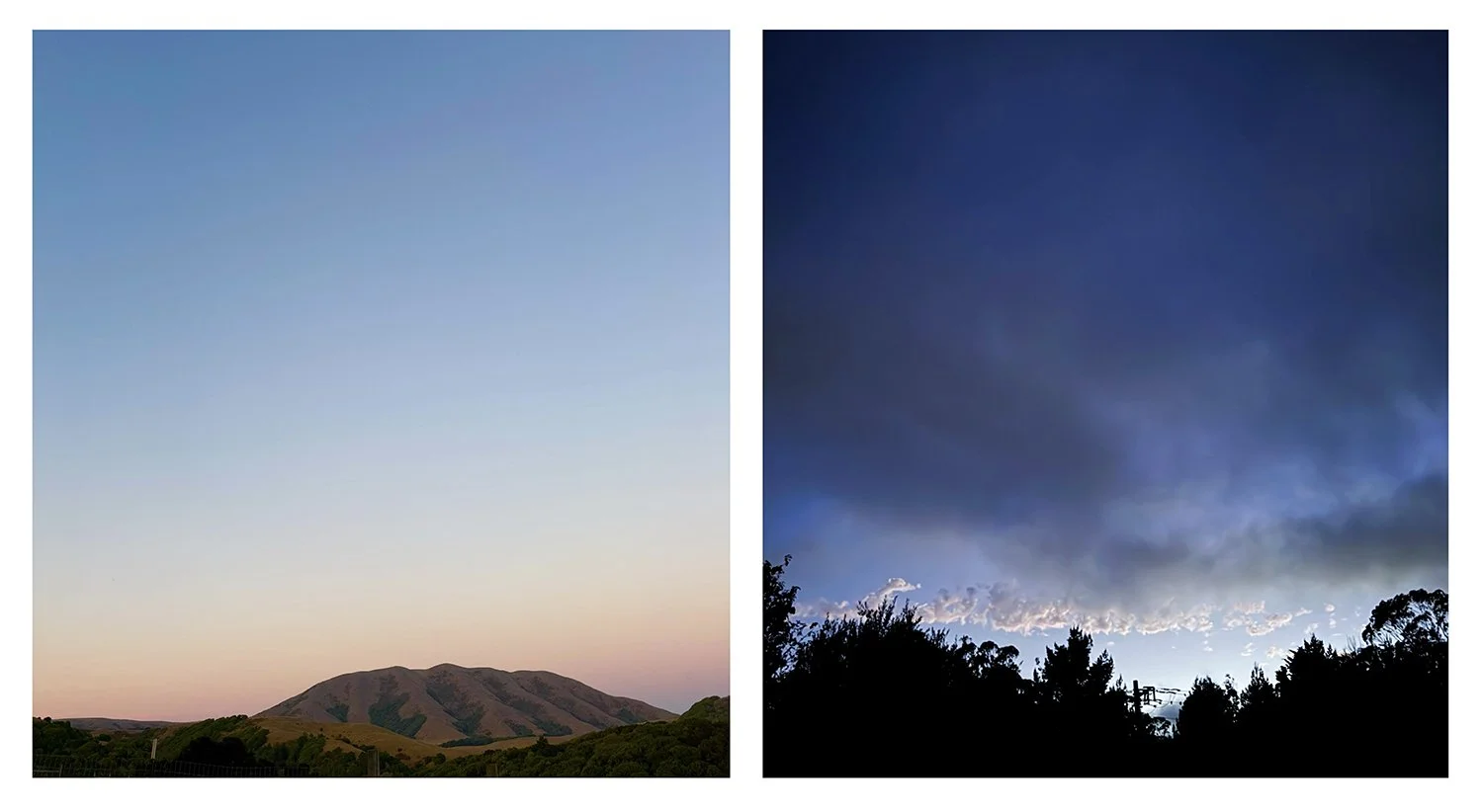
From there we walked upto the top of Russian Hill to see the incredible view across the bay towards the Coit Tower. The sky is just so unbelievably blue in California, I still can’t get over it sometimes.

We walked some more and then drove home through the city, stopping off to get a pastry for later. What a very satisfying day.

SF Botanical Gardens

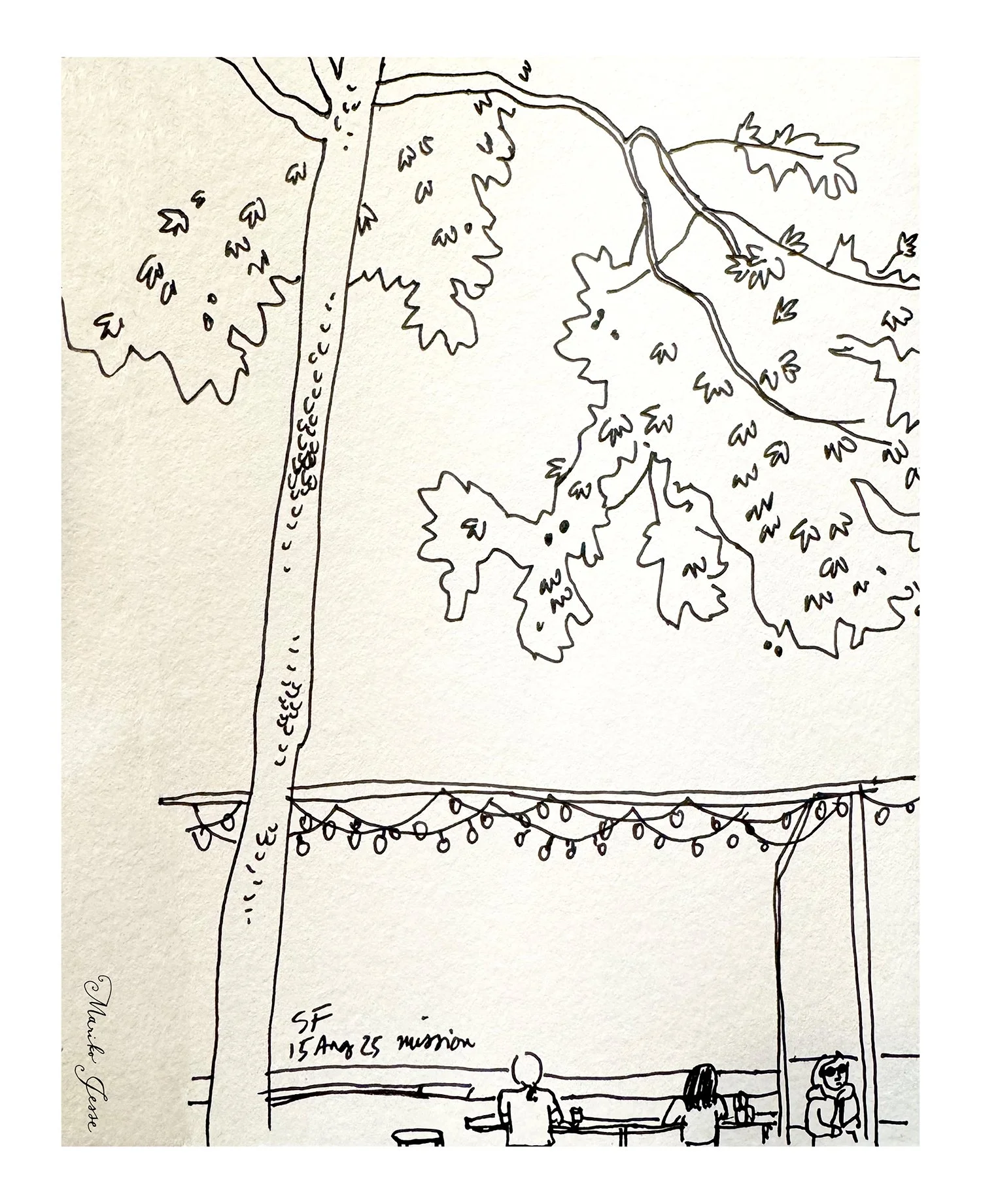
I spent a lovely morning in the San Francisco Botanical Gardens yesterday with a friend, sketching, having a small picnic, and catching up on the news.

I tried out some felt tip pens with brush nibs, and limited myself to a few colours. It was super relaxing and such a great way to unwind after a difficult week.

We nibbled on scones and blackberries and watched the geese. Sunny winter days are a treat!

wood + paper + box website

I’ve been redesigning the website of my printmaking collective wood + paper + box, and it’s currently up and running, but not yet totally finished.

I made an opening page with a background pattern of drawings I’ve done over the years of all our individual pieces, and I’m hoping to change this pattern periodically, to keep it interesting.

The site opener also has direct links to each of our four collective boxes: the main works we do together. When you place the cursor over the name of each box, an image appears of that box. We have so many beautiful photographs now of our work, I wanted to highlight them as much as possible.

A new section on the site, that we didn’t have previously, is Exhibitions. We’ve had several solo shows, and taken part in some amazing group shows, and you can see photos and read about them here.

I’ve added an extra section of products that you can purchase from us - featuring our incredible hand-made baren pins.

I’m hoping to add descriptions to each photograph on the site, and expand on the projects we’re doing, including what we’re working on currently. But all in time.

Please take a look and let me know if you have any comments so far!

COPE jingles

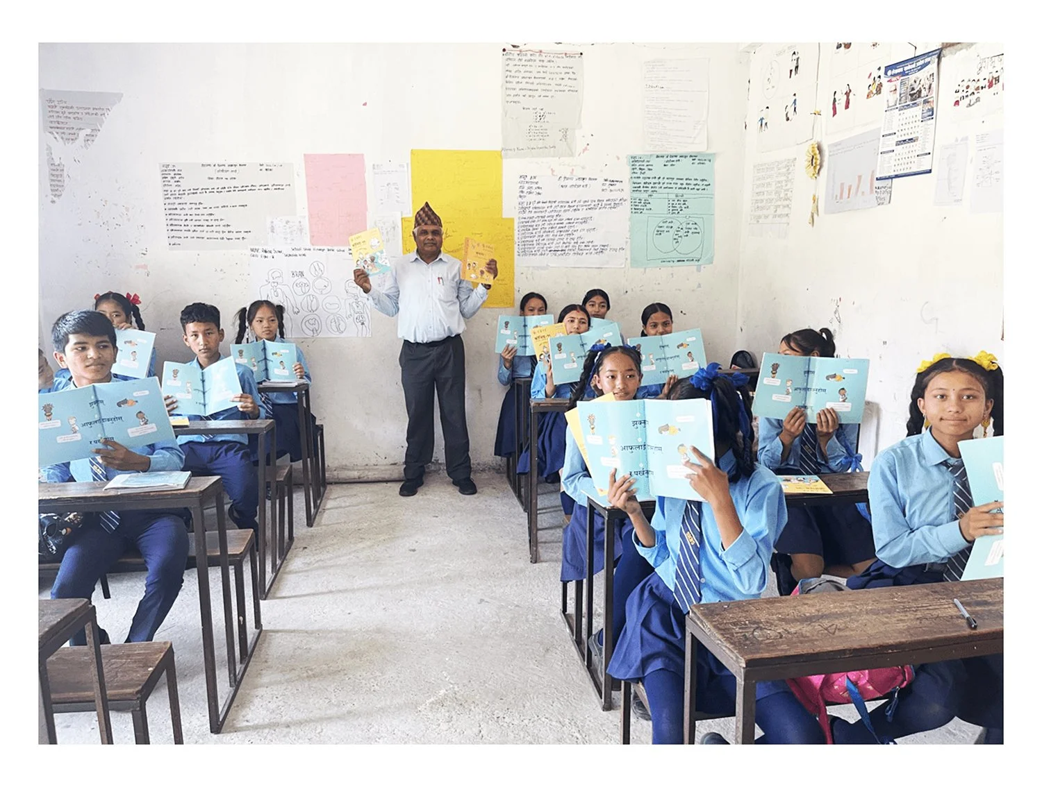
To go with the COPE picture books, we’ve been working with Teng, a company in Singapore, to bring the main message of each book to life with an animated jingle.

Jingles are an excellent way to capture children's attention and teach them essential safety lessons. Our new Earthquake jingle makes learning about earthquake preparedness fun and memorable, helping kids understand the critical Disaster Risk Reduction (DRR) message: "DROP, COVER & HOLD."

Hopefully the catchy tune will help kids remember the message, and be prepared!

Working on the jingles, I had to essentially redraw parts of the illustrations, to fill in backgrounds and add new elements, which aren’t needed for a flat image in the books. Watching my illustrations come to life is fascinating.

There are currently three jingles to watch on the COPE website here and all the books can be downloaded for free here.

COPE in the Philippines

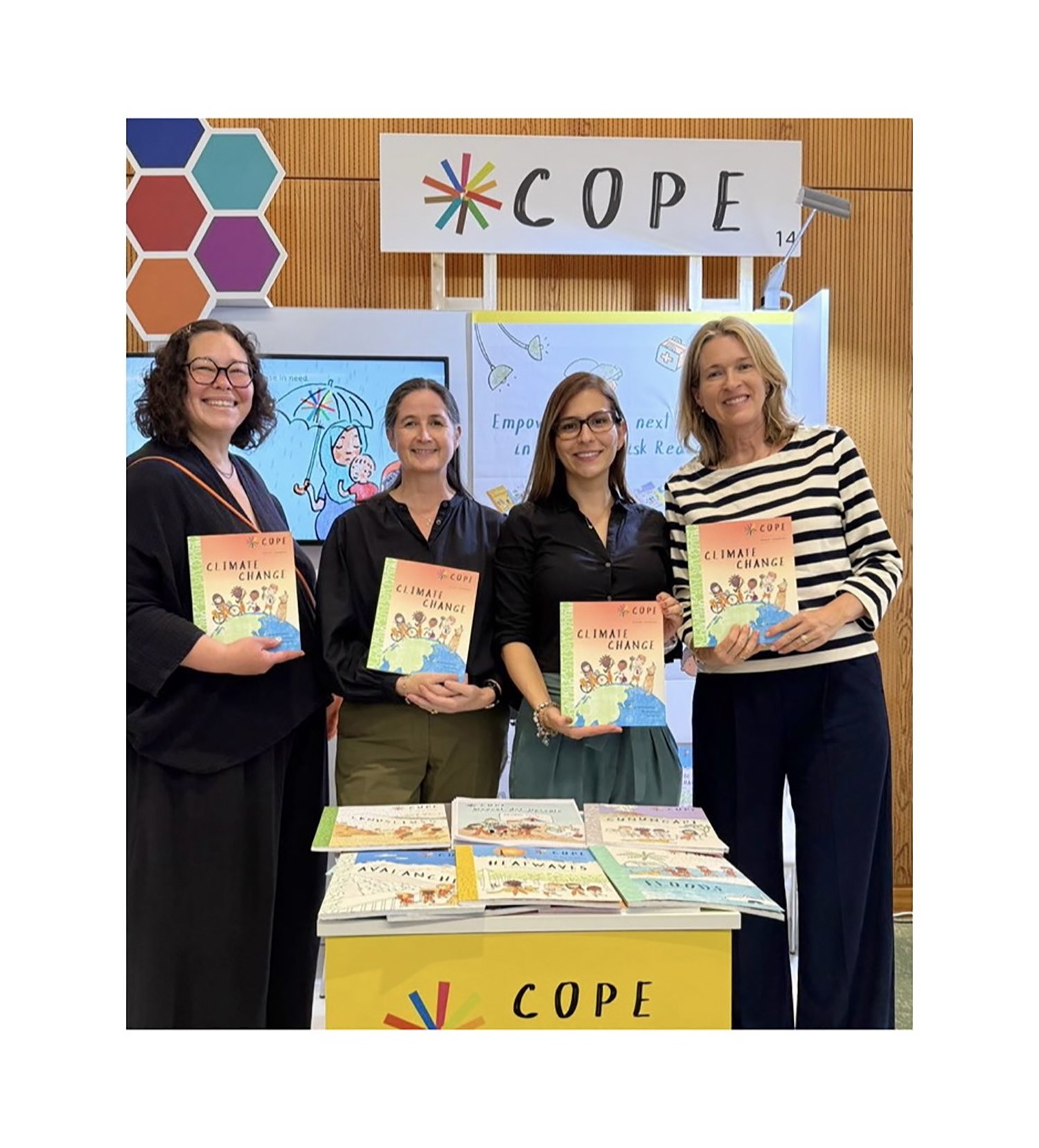
This week the COPE team has been in Manila at the Asia-Pacific Ministerial Conference on Disaster Risk Reduction (APMCDRR) 2024 promoting the books, and to launch the new Tsunamis book.

This is Martha, Christine and Lina, in front of the COPE stand. Unfortunately Tim and I couldn’t be there, but I loved seeing all the busy pictures and hearing the stories of the event!

All the books, especially the ones translated into languages other than English, were highlighted and promoted.

The launch of the expanded Tsunami book commemorates the 20th anniversary of the 2004 Indian Ocean tsunami, and brings vital tsunami preparedness knowledge to children and communities worldwide. We originally had a much shorter tsunami booklet, but this new version fits into the whole collection with an extended story section and more information.

Here’s the trailer for the book!

mokuhanga printing

I was given some lovely sheets of washi to try by Eriko Fujita at the Mokuhanga Conference earlier this year, for a project sponsored by the papermaker - Narushima Washi. I thought about what to make for a long time, and eventually decided that a simple flower could be the base for me to try out some new ideas…

I wanted to experiment a bit, and make some work that really highlighted the paper. I like to leave a lot of negative space for the paper to shine. I tested out colours, carved a block, and prepped my paper to print…

I set up my space, and managed to do all the prints in a day. I kept the leaves of my flowers all the same, with a two-colour bokashi, and then experimented with monoprinting techniques for the flowers, so each is unique and has its own special pattern.

I chose the best of the prints, and created a variable edition of 12. I liked the creamy colour of the paper alot, although it took time to get used to the slightly different texture than I’m used to.

The four prints at the top have been sent to Japan, to be shown in an exhibition in November alongside the work by many artists from around the world. I can’t wait to see how it looks!

conference presentation

My wood + paper + box collaborators Katie Baldwin and Yoonmi Nam gave a presentation at the MAPC Conference this week, about working collaboratively.

The pieces in the slide above are my cloud, leaf, puddle print from our box Mise-en-Scene, and my dammerung accordian-fold piece made to show the changing weather over a landscape, that can be viewed from different angles. They illustrate how work that is produced for a collective project can influence the work made in our own art paractice.

Our handling copy of the box Mise-en-Scene from the Beach Museum was on show at the presentation, and everyone could try their hand at making arrangements from all the pieces.

podcast interview

Back in June I sat down to have an online conversation with André Zadorozny for his podcast The Unfinished Print. It’s a niche podcast all about mokuhanga, and we discussed my printmaking practice, as well as my career in illustration, my travels, and how everything in my life has fed into my work.

I’m always a bit nervous speaking in interviews, but as I had met Andre at the mokuhanga conference in Japan in the Spring, it felt a little less daunting, and I relaxed into it. We covered a wide range of subjects and had alot of fun.

“The journey of an artist is a winding one. You make the decision to start, not knowing where it will take you. Over time, if you're fortunate, you build a career from your work while gaining the freedom to explore new forms of expression, with each project becoming an important and affirming part of that journey.”

In this episode of The Unfinished Print, I speak with Mariko Jesse, a professional illustrator who has integrated mokuhanga into her artistic practice. Mariko draws inspiration from her life experiences, sharing insights on her family and travels. We discuss how living in San Francisco, Hong Kong, and Japan has shaped her outlook and creative process. Mariko also reflects on her involvement with MI Lab, now based in Echizen, Japan, as well as travelling to the International Mokuhanga Conference in April 2024.  Finally, we explore Mariko's collaborations with The Mokuhanga Sisters and wood+paper+box, and how these partnerships shape her own artistic practice. - A. Zadorozny

Memory Lane Exhibition

I currently have two mokuhanga prints in a show at the Pacific Arts League in Palo Alto, California.

The show is about how stories and memories are connected to the images we create. I wrote about how when we moved to California, the idea of growing a lemon tree was like a dream, and that it inspired to me to create this print of a branch of a meyer lemon tree, and about seeing a frog hiding from the rain under a leaf in Japan.

There’s still a few more days to see the show, do let me know if you make it.

Mini-Print show

My newest mokuhanga print Wildflowers is currently on show in Taiwan at the IPC International Mini-Print Exhibition at Teh-Chun Art Gallery.

I made this print while I was in Japan earlier this year, and this is the first time it has been shown publicly. I based the image on a tiny drawing in my sketchbook of some wildflowers I had in a simple vase at home. I’m interested that the organisers chose to put my print in the catalogue on a page where all the other prints are black and white!

Do let me know if you manage to go to the exhibition, I’d love to hear your thoughts. After the show, the print will be held in their permanent collection.

COPE and the UN

I am honoured to share that COPE, the children’s book series that I have been illustrating for several years, has been highlighted by António Guterres, Secretary-General of the United Nations, during a recent visit to Tonga. Mr Guterres joined forces with the World Meteorological Organization and METService to raise awareness about the #StateofClimate and the critical need for #EarlyWarningsForAll, particularly in the Pacific Islands. On the frontline of #ClimateChange, these islands face immense challenges from natural hazards and disasters.

I created a special illustration featuring the Secretary General of the UN, and also all the new heads of the WMO.

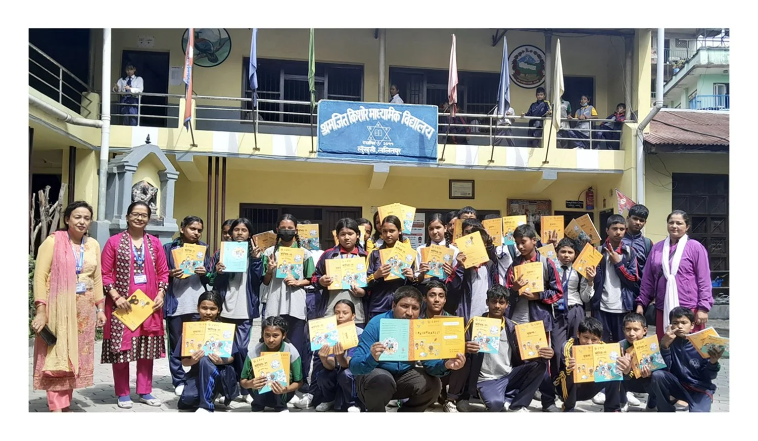
I am absolutely delighted that António Guterres launched a new booklet from the WMO/COPE Disaster Champions series when he took time from his busy schedule to visit a local school. The Cyclones book has been translated into Tongan, especially for the local children.

You can read more about the initiative with the WMO here.