I drew a variety of cosmetic products for BEYORG's Christmas packaging in HK this year, creating a fun repeat pattern. It's been used on the website and shopping bags. There are 2 colourways... ... a very Christmassy red and green, and a more modern red and white...
 If you see anyone carrying a bag with the design, do let me know!
packaging
BEYØRG
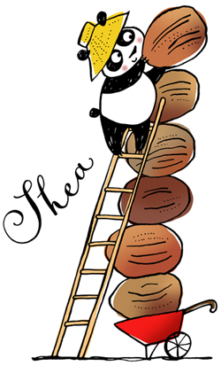
I worked with organic cosmetic company Beyørg (Beyond Organic) in HK this year, to create images they could use on promotional products, supporting the Breast Cancer Foundation charity. I drew pandas (cutest of all Asian animals) interacting with various ingredients from the cosmetics, such as acerola fruit, ginseng root, and white lupin flower. The illustrations also featured a farm element, as the client wanted to emphasise organic farming. I tried to make the pandas cute, but not too cute. They were used on packaging, and promotion for the brand.
 I created a repeat pattern with the pandas along with some extra elements, and this was used on a patterned white umbrella. I love it!
  The umbrella is a limited edition gift item for customers in the shop, and will only be available until the end of August. There's also a cuddly panda...
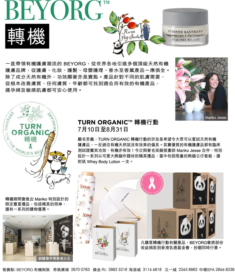 The products have been featured in various local magazines, along with a little about me. How nice!
Juri's Cotswolds tea shop
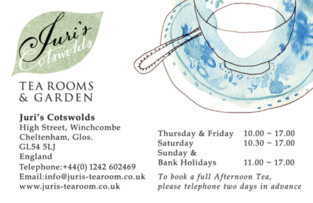
I did some work recently for a lovely little teashop in Winchcombe in the Cotswolds called Juri's. I did a hand lettered version of their original script font for their logo rebrand, and added a classic typeface for their house font.  I created 4 watercolour and pen illustrations for their home-blend tea pack labels, basing the illustrations on the blue and white china they use, and the delicious cakes and jam that Juri makes.
  There's a dotted line at the bottom of each label, for Juri to write in the particular blend of tea in the pack by hand.
 I also added one of the teacup illustrations to their shop information card. If you fancy a delicious cake and cup of tea, this is the perfect place...
 I worked with my dad Nick Jesse on the layout and type for the project.
chocolate packaging
Chinese New Year is just round the corner, and I've designed some exclusive packaging for Hong Kong based personalised (you can create your own flavours!) chocolatier chocoyou. The special new year red and gold sleeve is wrapped around a gift box of 5 chocolate bars. 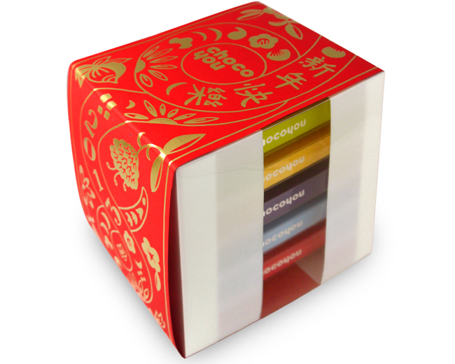 2013 is the year of the snake, so I've based the illustration on a stylised Chinese papercut snake. When opened up flat, it also works as a fai chun (lucky sign) you can put up in your house. The shiny gold brings good fortune, wishing you a prosperous new year. Here are some of my sketches for the project...
 I also designed a sleeve for a special Valentine's Day set.
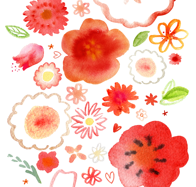
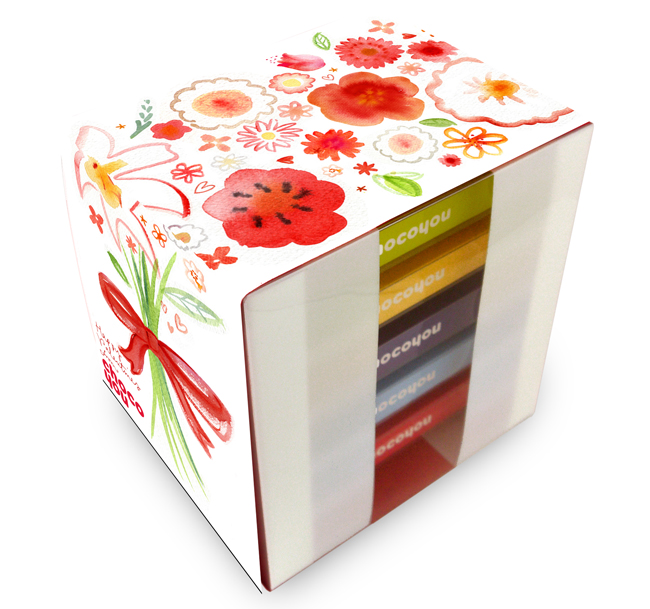 The pretty watercolour floral illustration is a romantic Valentine bouquet.
 You can order both these box sets here, the perfect gifts.
