My friend Nathan asked me to create some illustrations for his wedding invitations, and I came up with several ideas for the three different event cards. Each card had a slightly different level of formality, so I tried to accommodate that. I also drew a little vignette of their names for the cards, that could be used on various stationery. I was asked for 'rustic but stylish', as the wedding was in Yosemite National Park, so I thought about the time I'd been there, and concentrated on the sweeping views and sequoia trees.
The first event was on the lawn at the Wawona hotel, where I drew the lovely floral arrangements in the glowing early evening light.
I also drew a little vignette of their names for the cards, that could be used on various stationery. I was asked for 'rustic but stylish', as the wedding was in Yosemite National Park, so I thought about the time I'd been there, and concentrated on the sweeping views and sequoia trees.
The first event was on the lawn at the Wawona hotel, where I drew the lovely floral arrangements in the glowing early evening light. The wedding ceremony took place on the lawn of the Ahwahnee hotel, with the glorious mountains as a backdrop, on a perfect summer day.
 As a wedding favour each guest was given a waterbottle with my illustration of Half Dome on, but as a special thank you, Nathan and Strawn gave me a set of glasses as well, and I couldn't resist taking this picture.
  Congratulations to the happy couple!
wedding
wedding anniversary
Today is our first wedding anniversary, hurrah us! It's represented by 'cotton' or 'paper', depending on where you live, so I made this little etching on cotton paper...
thank you
I designed some thank you cards that matched our wedding Save-the-Dates and invitations, to send our lovely guests. The illustration features the watercolour leaves from the wedding, but small pink flowers have been added to the design, to show love blossoming... The leaves were printed in HK (my friend Sandy at Lui & Co handled this for me) on specially chosen thick soft paper, and these were then sent to my friend Katie Baldwin in the States, who letter-pressed my calligraphy and flowers by hand.
  This created the effect of softness and crispness, in one beautiful package. I hope it's a special way to thank everyone who shared our wedding, and those who sent us gifts from far away...
wedding loveliness
Designing and illustrating for my own wedding has been a pleasure. Stressful, but full of joy too. I created all the stationery first, with a green/pink/brown/white colour palette, and occasional border of green watercolour leaves, and then carried this through all the wedding elements. Simplicity was the key to everything.
 The reception was held at the Black Barn, in Berkshire (UK), a huge barn on a working farm, and a delightful setting for a perfect day. They don't have many weddings there, and I was free to create everything just how I wanted it...
 My brother Kenji was in charge of the bar (he's a drinks specialist) and he created a welcome punch for the guests, with watermelon hearts on the glasses, and special cocktails for the evening.
  I made the signage for both in the wedding colours.
 My friend Karen made bunting out of different shaped paper doilies and green ribbon, which we hung inside and outside the barn. I had lots of fun with the flowers, which I bought from New Covent Garden market and arranged with my mum, in my personal collection of vintage bottles, jars, and white ceramic jugs.
  The interior of the barn still takes my breath away. I wanted it to be pretty, welcoming, and sparkling, and retain the essential "barn-ness" of the venue itself. To create a glowing atmosphere, I used festoon lights for the ceiling, hung by the amazing James and Chris of acdisco, and smaller pinlights from thinkgadgets for the columns. My friend Alvin, of YMK design, oversaw all the technical aspects of the styling and installation.
 I painted the seating plan as vines with leaves, in the U shape of the table layout.
 In the entrance to the barn, photos hung on twine with wooden pegs (along with some framed photos of the bride & groom). Alvin took fun photos at the wedding with a mini polaroid camera, and these were also hung up for everyone to see.
 On the opposite side of the entrance was the centre-piece of the reception: the cake table. Friends brought hand-made cakes, meringues and puddings, and my friend Anna styled the table to look irresistible.
 I made hand-written doilie labels for the desserts, with the baker's name, aswell as the type of cake. I also made doilie candles in various heights, containing battery-operated tealights, for all the tables. Our official photographer Sonja Read took these beautiful photos of the cake table.
 My dad made our gorgeous wedding cake; three tiers of homemade fruit cake heaven...
 At the end of the cake table was a mini sweet shop. Everything came from my favourite treat website, Chorley & Baker. We had sugared almonds, milk bottles, gummy hearts, and apple bon-bons, all chosen with the wedding colours in mind.
 My friend Alex at ChocoYou even made delicious little hand-made chocolates with an edible version of my vignette illustration on them!
 My dad also made some lovely wine bottle labels, using elements of my illustrations. Each label had a portrait of us, and a quote about love.
 The amazing Street Kitchen provided the catering. They parked their airstream just outside the barn, and everyone went up to collect their food. For the main course, I used eco-friendly plates that matched the barn, that we could recycle,
 and for the desserts, I gave each guest a personalised vintage side plate. They doubled as place settings and wedding favours, and were such fun to make.
 I bought plates from Portobello market, thrift stores in San Francisco, and charity shops all over London, and then created a dotty calligaphy font in ceramic paint, which could be baked on, to become permanent.
 It was our dream wedding, and I'd like to thank everyone who helped us with all the planning, designing, installation and clean-up (especially Johan, our wonderful DJ friend). It simply wouldn't have been possible without the help of all our friends and family.
Everything was perfect, and I'm full of love for all of you...especially my adorable new husband.
wedding detail
There are so many things I'd like to show from my wedding, but for now, here's a photo of the ceramic wedding cake topper that my friend Aude made for us. I love it so much! I'm away on honeymoon for two weeks, and when I get back, I'll blog lots of gorgeous wedding stuff...
wedding (mine!)
in design, drawings, illustration, people, wedding
I'm getting married tomorrow, hurrah! Here's our Save the Date. I kept to a simple colour palette of greens, pinks and browns, on white. This runs through all the stationery and the decoration at the reception. We're having a Quaker wedding, so I drew two of the founding members for the invitation,
 and a little vignette of me and my fiancé for the cover.
 Congratulations us, happy days!
Janice's wedding
Another pretty wedding project for a client in Hong Kong. She asked for two pheonixes, a bird symbolising longevity, that could be used in various elements of her wedding. I created several stages of the pheonix motif, in two slightly different colourways.
The first illustration showed two flying birds, with the bride and groom's names interwoven into the design. This was used on the Save the Date notification and formal invitations, in the traditional Chinese wedding colours of red and gold. The next version of the illustration showed the story growing, and included a little landscape, with a tree and butterflies. This was used on the first stage backdrop used at the actual wedding, in soft pinks, with a watercolour textured backgoround.
 The illustration developed, with clouds and a golden moon, for the next stage backdrop in red and gold...
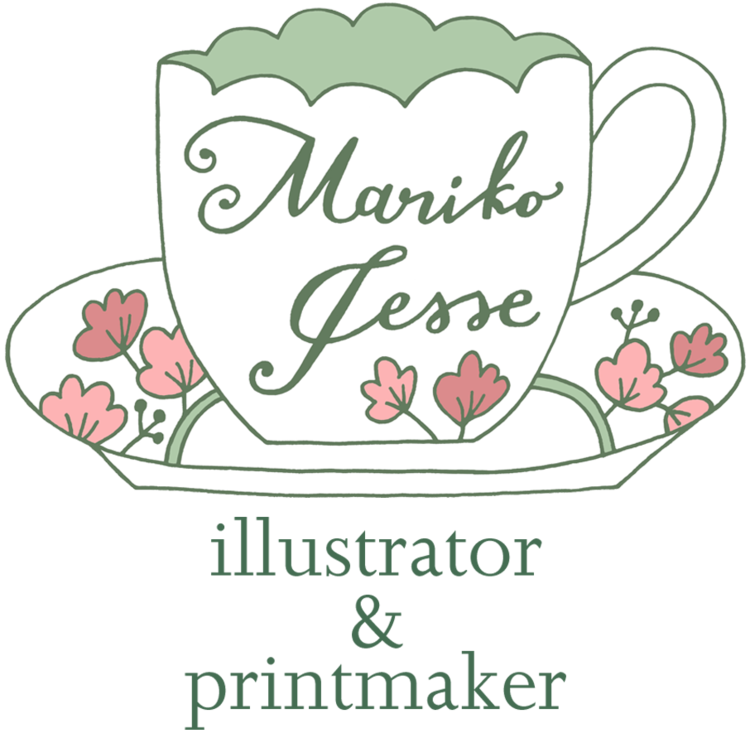
 And the final development of the illustration included musicians outside a cosy house, and a little golden nest in the tree. This was used on a specially made china teacup, given as a wedding favour to each guest.
 I adore this cup, it's such a lovely gift to remember the wedding...
Karen's wedding sketches
in drawings, friends, sketchbooks, wedding
I did a few sketches while at my friend Karen's wedding. It was held in the University Chapel in Glasgow, which was rather grand and imposing, but everyone was so happy and beautiful it felt warm and cosy. I really adore Scottish weddings, with all the men wearing kilts... Karen's dress was classical and simple...
 The flowers at the reception was adorable, lots of anemones and simple glass jam jar holders.
Karen's wedding
I created the wedding invitations, place settings and seating plan, for my friend Karen's wedding recently, up in Scotland. They had a map theme, mixing elements from both London and Glasgow, the cities where the bride and groom live. We chose pink and brown to give a lovely vintage look, to match the overall theme of the wedding.
 The place settings had elements of the invitation illustration on the front, with a little bonus illustration of Karen's spaniel in a neat bow-tie on the reverse. I added a delicate die-cut pop-out shape for the guests' names, which I hand-wrote in brown ink. I then also hand made name settings for the tables to match.
 The tables were named after roads in both Glasgow and Scotland. I designed the seating plan around this concept, making it into a street map, with each individual place marker as a geographic feature on the map: a house, a tree, a car, a statue...
  Us and the seating plan on the day...
 The wedding photos were taken by Christopher Currie.
wedding invitations again
Me again, here's an additional feature continuing on from my post about my friend's wedding invitations... The groom is a multi-media expert, and made this little animated feature of the map I illustrated for him. I love this so much! Hope you enjoy...
Ping's Proposal from mariko jesse on Vimeo.
wedding invitations
So, my good friend Ping got married this May, and I designed his wedding invitations, and also created a special map for him of Central Park in NY (where he made his romantic proposal). The style brief for the invitation was a vintage, country feel, with a quirky, hand-made aesthetic; light-bulbs hanging from wooden rafters and flowers in jam jars, that sort of thing.
I created a simple, hand-lettered invitation, in two slightly retro colours, with a few illustrative details. Inside, the card was also hand-lettered.

 The card design was used as a detail throughout the wedding, with cards on the tables as menus, place settings and memory cards, where everyone could write notes for the bridal couple and hang them up on a washing line...


The map I created for them was a narrative of where they walked that day, where Ping hesitated, where they got lost, and where he finally proposed.
 It was used as an animated feature in a mini-movie of the wedding, and also as a back-drop for the stage at the reception:
 What a lovely wedding...
*the photographs were taken by Tec Petaja