I recently illustrated a small map of Vermont for Middlebury Magazine. It's a lovely little article about the author's annual journey to Bread Loaf.  I think it's always interesting to see how an illustration starts, so these are the initial sketches I made when I was thinking about how to approach the project. The first sketch, which I ended up working with, shows the map from an aerial bird-eye view, and the entire route. The second sketch shows the road to Bread Loaf in a more 3 dimensional way, although some of the road is hidden behind hills...
 I take the page layout into consideration when I work, so it makes me happy to see everything come together nicely on the printed page.
maps
HOBBS USA
HOBBS of London, a boutique fashion brand I've done a bit of work for recently, famously known for being a favourite of Duchess Kate, has just opened their first US store in Greenwich Connecticut. I did several pieces of new artwork for both the store itself and its launch. Some of the artwork I did for the London stores, plus a few new pieces, have been printed and framed inside the elegant new location.
 I love the way the artwork has been mixed and matched and hung together in different combinations to create a 'collection'. Some has even been framed up for the changing rooms...
 I also did a detailed map of the area around the new store, full of interesting buildings, a park, and some historic houses...
 ...which is now framed up and on display.
 It looks like a wonderful store, I hope I'll get to visit one day.
  Thank you to Hobbs for providing these photos.
Japan map
I've been planning some trips for the year, and trying to decide where to go, so I've been looking through some of the old maps I did for Conde Nast Traveller for inspiration. I found this full page map of Japan in the cherry blossom...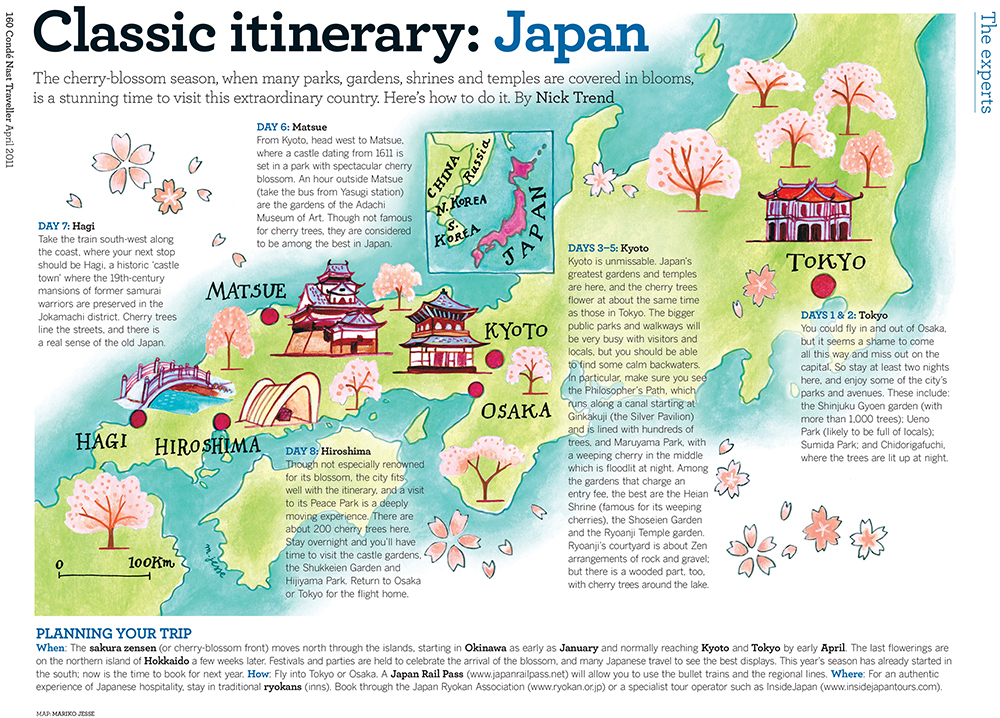 and am thinking it might be just the ticket!
Rio map
To celebrate the start of the 2016 Olympics, here's a map of Rio I did for Conde Nast Traveller a few years ago. Hope it goes super well! I did a few little Rio icons for the article too...
![]()
HOBBS High Street Kensington part 2
The new HOBBS store in High Street Kensington, London is open! And lots of my specially commissioned illustrations are framed and decorating the walls... I was asked to create illustrations for the stores, in a variety of styles, that reflected their values of quality and British heritage.
 I also made a special map of the surrounding area showing the wonderful buildings and streets you can explore near the new store.
 I highlighted some of the HOBBS iconic fashion items...
 ... and added in elements like local British flowers and animals.
 Foxgloves and sweetpeas, foxes and a stag...
 ... and of course a countryside feature, the pheasant!
 I also did some hand-lettered quotes, some etchings, and included some pages from my sketchbooks.
 I hope you'll be able to visit and let me know what you think. Happy shopping!
Thanks to Nick Jesse for the store photos.
Tiffany mug on instagram
I was thinking about my Tiffany & Co. mug the other day, and checked on instagram if anyone had posted any pictures of their mugs, and found some amazing images. I especially love this one... Thank you amberallurecupcakes !
And here's a selection of some others, a big thanks to everyone who posted them. So glad you're enjoying your mugs...
Thank you amberallurecupcakes !
And here's a selection of some others, a big thanks to everyone who posted them. So glad you're enjoying your mugs... I love instagram so much!
kapok 10 year anniversary
kapok, the hipster boutique lifestyle store in Hong Kong had their ten year anniversary this weekend, and they've been building up to it with a variety of events. I designed and illustrated a map for their #kapok10 anniversary launch, and they've used elements from it throughout their stores, website and social media. I've never created a map from scratch before, by which I mean that it's an imaginary place, not a real one. I was asked to create a country that embodied everything kapok stood for: creativity, fun, fashion and a truly international flavour. I could start anywhere! And of course a new country needs a crest: kapokland's features the pink dolphin of HK and their new motto: 'future classics'
 Here's the full map, showing an archipelago of different exotic fantasy islands, covering all seasons at once, with both tropical and arctic lands.
 The reverse side of the map also featured a close-up of the main town in kapokland: Kapokville. The town had shops and museums, but also global embassies, a castle and even pedalos!
 This is how it was used on the kapok website...
 They even had a stand at a local design market with fun illustrated props for customers to interact with...
 ...and also used some of the animals as a banner on facebook...
 I especially liked how they used details from the map on the store windows...
 and inside...
 Congratulations kapok! Here's to the next 10 years of fabulous!
Connecticut magazines
in illustration, lifestyle, maps, press, special commissions, travel, USA
I recently created some maps for a series of town guide magazines for Litchfield, Ridgefield, Fairfield, Bedford + Pound Ridge, and Wilton, in beautiful Connecticut, USA. The magazines are super nicely produced, and full of useful local information.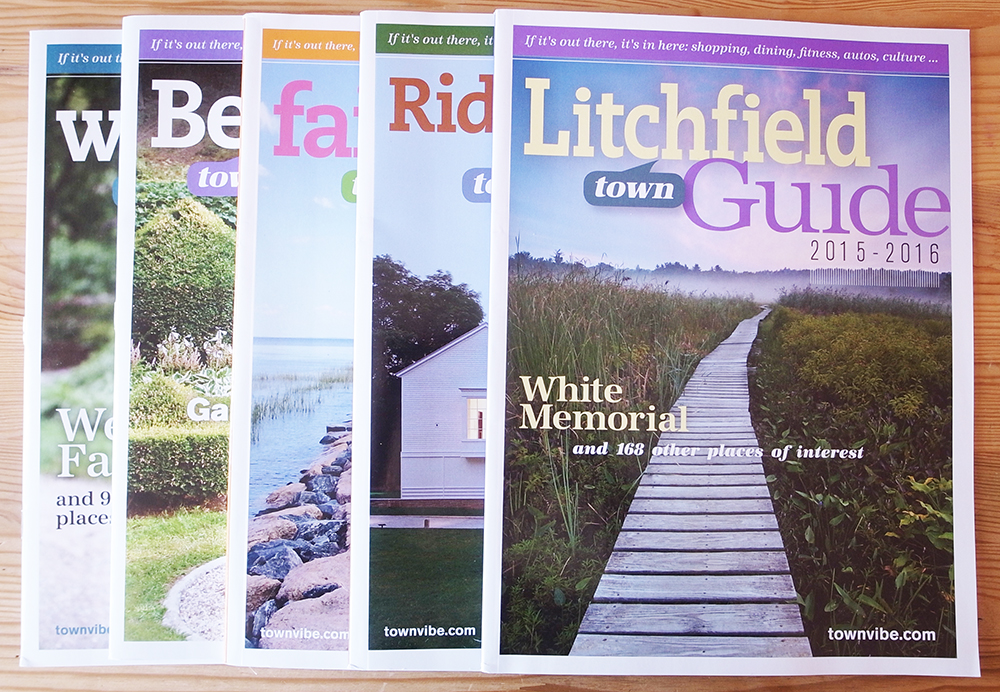 I illustrated one map per magazine, like this:
 Small details from the maps were used throughout the articles to highlight various attractions and historical notes.
 You can see the town websites here. I hope I can go there one day!
Sicily map
I haven't featured any maps recently, so I thought I'd show this map of Sicily I did for Conde Nast Traveller in the UK . I painted it a while ago, and I like the way it's placed in the page, giving it lots of room to breathe. I also thought I'd show my rough sketch for the map:
 You can see how the outer shape of the sea around the island has changed, and a few things, like the distance scale, have moved, and that I removed all the tiny outer islands. The final map became more streamlined, and focussed on the important elements. The bright Mediterannean colours were wonderful to paint.
Puerto Rico map
I've been doing city and country maps for PCMA Convene magazine in the US for quite a while, and for the most recent issue, I did a clean, bright, minimal map of Puerto Rico, highlighting a few places with black & white pencil icons.
Chicago Magazine
I've illustrated a fun map in the current issue of Chicago magazine, about places to day-trip around Chicago. It features all sorts of interesting stuff, like lighthouses and famous ice-cream parlours! I also created some little icons that were used throughout the whole road-trip article...
Tiffany & Co. mugs
My Fifth Avenue Tiffany designs have been made into special little versions in Japan, with angled sides. Little and cute works well there!  They're available exclusively in Japan, either in store or online.
Jenny's wedding
in design, hong kong, illustration, lifestyle, maps, people, Uncategorized
I created the Save the Date and wedding info card for Jenny and Randy in Hong Kong this summer. Their Save the Date was interesting, as they asked for a map showing all the places that meant something in their lives, especially Okinawa in Japan, where they got engaged.  They requested three colours: brown, pink and champagne...
 I then made a more detailed map of Bali, where the wedding was taking place, showing all the various wedding event venues. It featured little pictorial icons of some of the surprises in store for their guests.
 They also printed tote bags featuring the Save the Date map as favours for their guests. Nice!
  Congratulations guys! What a cute couple...
 First photograph is by Jada Poon Photography, and second is by Johnny Productions.
Conde Nast Traveller map
in illustration, maps, travel
I've just seen the April issue of Conde Nast Traveller UK and am super happy with my illustration. I tried a fun, loose and brightly-coloured style for this map of Amsterdam.
Karen's wedding
I created the wedding invitations, place settings and seating plan, for my friend Karen's wedding recently, up in Scotland. They had a map theme, mixing elements from both London and Glasgow, the cities where the bride and groom live. We chose pink and brown to give a lovely vintage look, to match the overall theme of the wedding.
 The place settings had elements of the invitation illustration on the front, with a little bonus illustration of Karen's spaniel in a neat bow-tie on the reverse. I added a delicate die-cut pop-out shape for the guests' names, which I hand-wrote in brown ink. I then also hand made name settings for the tables to match.
 The tables were named after roads in both Glasgow and Scotland. I designed the seating plan around this concept, making it into a street map, with each individual place marker as a geographic feature on the map: a house, a tree, a car, a statue...
  Us and the seating plan on the day...
 The wedding photos were taken by Christopher Currie.
wedding invitations
So, my good friend Ping got married this May, and I designed his wedding invitations, and also created a special map for him of Central Park in NY (where he made his romantic proposal). The style brief for the invitation was a vintage, country feel, with a quirky, hand-made aesthetic; light-bulbs hanging from wooden rafters and flowers in jam jars, that sort of thing.
I created a simple, hand-lettered invitation, in two slightly retro colours, with a few illustrative details. Inside, the card was also hand-lettered.

 The card design was used as a detail throughout the wedding, with cards on the tables as menus, place settings and memory cards, where everyone could write notes for the bridal couple and hang them up on a washing line...


The map I created for them was a narrative of where they walked that day, where Ping hesitated, where they got lost, and where he finally proposed.
 It was used as an animated feature in a mini-movie of the wedding, and also as a back-drop for the stage at the reception:
 What a lovely wedding...
*the photographs were taken by Tec Petaja
introducing my portfolio
Today I'll be talking you through my portfolio: how I've divided and sub-divided the sections and why. The first section is 'editorial'. This features illustrations I've done for magazines and newspapers. I've split this into several themes: 'food', because I like doing work on this subject the most, 'lifestyle', because so much fits under its umbrella, 'people', because they’re always engaging and 'horoscopes', as every illustrator quite simply must have one.
 The next section is 'special commissions'. This contains projects that are unique and don't necessarily fit easily into any fixed category. These are the projects I love best. Among them are ceramics for Tiffany & Co., backdrops for a photoshoot for Martha Stewart Weddings, and drawings on napkins for a charity exhibition.

'books' features all the large publishing projects I've worked on, from the detailed illustrations throughout the River Cottage everyday cookbook, to the many children's books I've illustrated, finishing with my book covers for various international novels.
I've been making maps for many years, almost from the beginning of my career, and the 'map' section shows a highlight of the various kinds: 'large scale' shows maps that are close-up and detailed, with road names and exact locations. 'small scale' tends to be maps of large areas, or whole countries, where capturing the atmosphere is most important. 'Penline' shows maps with a looser line, in a more graphic style, while 'concept' features more unusual maps, with a specific angle.
'editions' showcases my art prints: etchings (of ceramics and travel), Japanese woodblock prints, lithographs, and also a small selection of my medium-format photographs.

The section entitled 'personal work' shows the more intimate side of what I do. Sketchbooks are my constant companions, where all that I see and think are noted for future reference. 'things I've made' are objects I create, decorate and make interesting, 'greetings cards' is where I show the special cards I've designed, while 'exhibitions' contains photographs of the shows I've had of my work.
'about' tells you a little about me (you can see what I look like too), 'clients' is a list of some of the people I've worked for, and 'contact' tells you how you can find me to tell me, well, anything you'd like really. Or better still, that you'd like to commission me for something....
Oh, there's also a discreet 'links' button at the bottom of the page to let you know other websites I like.