illustration

BEYORG 'Book of Organic Wonders' project

I created an illustration for BEYORG’s 2021 special Christmas ‘Book of Organic Wonders’, which is a sort of advent calendar containing organic cosmetics from Australian brand A.O.R.

I love how the illustrations are spread out onto the separate drawers on the box!

Here you can my sketches for the illustration, from stage one to the final stage before I start doing the actual artwork. In between these two stages the client made revisions and requested more animals and flowers. I designed the illustration to be partially pen and ink (animals and people) and for the botanical elements to be painted.

The illustration has also been used on a lovely tote bag.

I think it would be lovely, once you’ve used all the cosmetics and eaten the jam, to reuse the box for keeping things in!

You can purchase the box on the BEYORG website here.
Illustrator's Fair

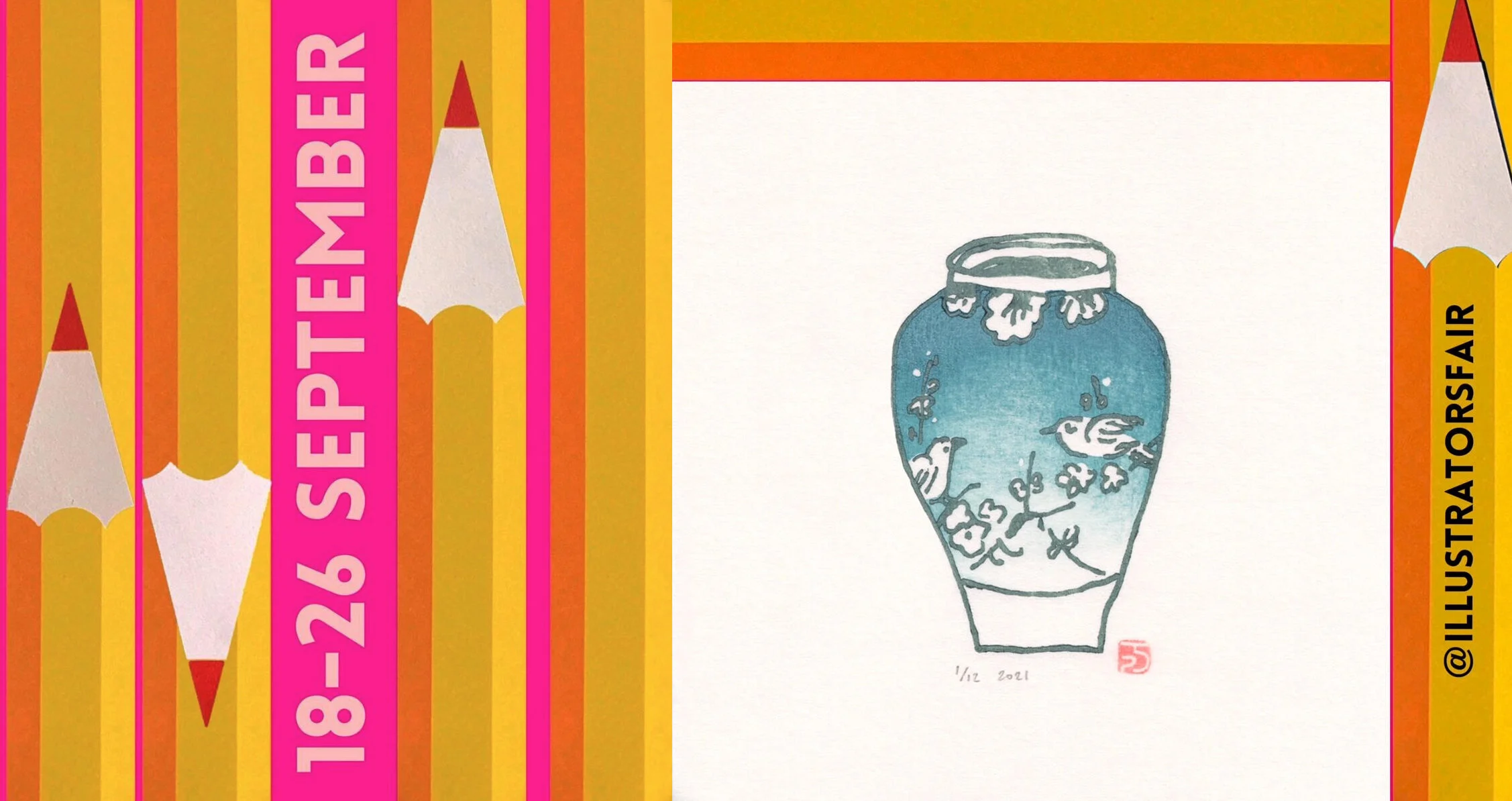
I’m extremely happy to be taking part in the online Illustrator’s Fair again this year. It aims to promote the work of over 100 contemporary Illustrators as part of the London Design Festival.

promo.jpg

I’ve added lots of lovely new prints to my online shop especially for the Fair, including some of my recently completed Dusk landscape prints, as well as many of my florals.

works.jpg

You can find out more about the Fair here, and I do hope you’ll take a look around, both at my website and shop, and those of all the other great featured illustrators.

COPE Wildfires book

This summer, to coincide with the California Wildfires season, we launched the new COPE picture book.

COPE Wildfires cover copy.jpg

For the first time, the COPE team visit two different locations to study a natural disaster…

COPE_Wildfires-10 copy.jpg

They go to South Africa first, to look at the effects of the large wildfires that happened in Knysna…

COPE Wildfires 20 copy.jpg

…and then move on to California and the Sonoma fires. I was especially pleased and honoured to get the chance to draw a portrait of San Francisco’s Fire Chief, who supported the book.

cheif neen.jpg

It’s always hard doing the research for the books, these disasters are getting more common due to increasing climate change, but I hope that they’ll save the lives of children who’ll be more prepared and know what to do in they find themselves in the midst of an emergency situation.

COPE_Wildfires-44 copy.jpg

As always, you can read the books for free on the COPE website. Be prepared!

sustainable editoral

Here’s a pen and ink illustration for the cover of Grocery Business Magazine that I completed recently. It’s about Kroger, a supermarket chain in the US, that is making efforts to be more environmentally sustainable.

kroger.jpg

It was really interesting to do the research for this piece, and find ways to create icons for all the important elements of this subject. You can read the article here. Every little helps!

I love seeing how art directors and designers use my illustrations in websites too…

contents 2.jpg

Eric Carle

The wonderful illustrator Eric Carle passed away this week, and I’ve been thinking about all the ways he inspired me. Reading the Very Hungry Caterpillar is one of my earliest memories - I loved the colours, the holes in the paper, and the surprise ending. Along with Maurice Sendak’s Where the Wild Things Are, it was the book that made me want to become an illustrator…

There’s an animated version you can watch here.

There’s an animated version you can watch here.
When I was looking for a way to use collage as a technique for an illustration project, I watched a video of Eric explaining how he worked. I love his rough textures and bright colours and how he used simple cutting and super advanced glueing in his pictures, and he added colour pencil details.

ec i 7.JPG

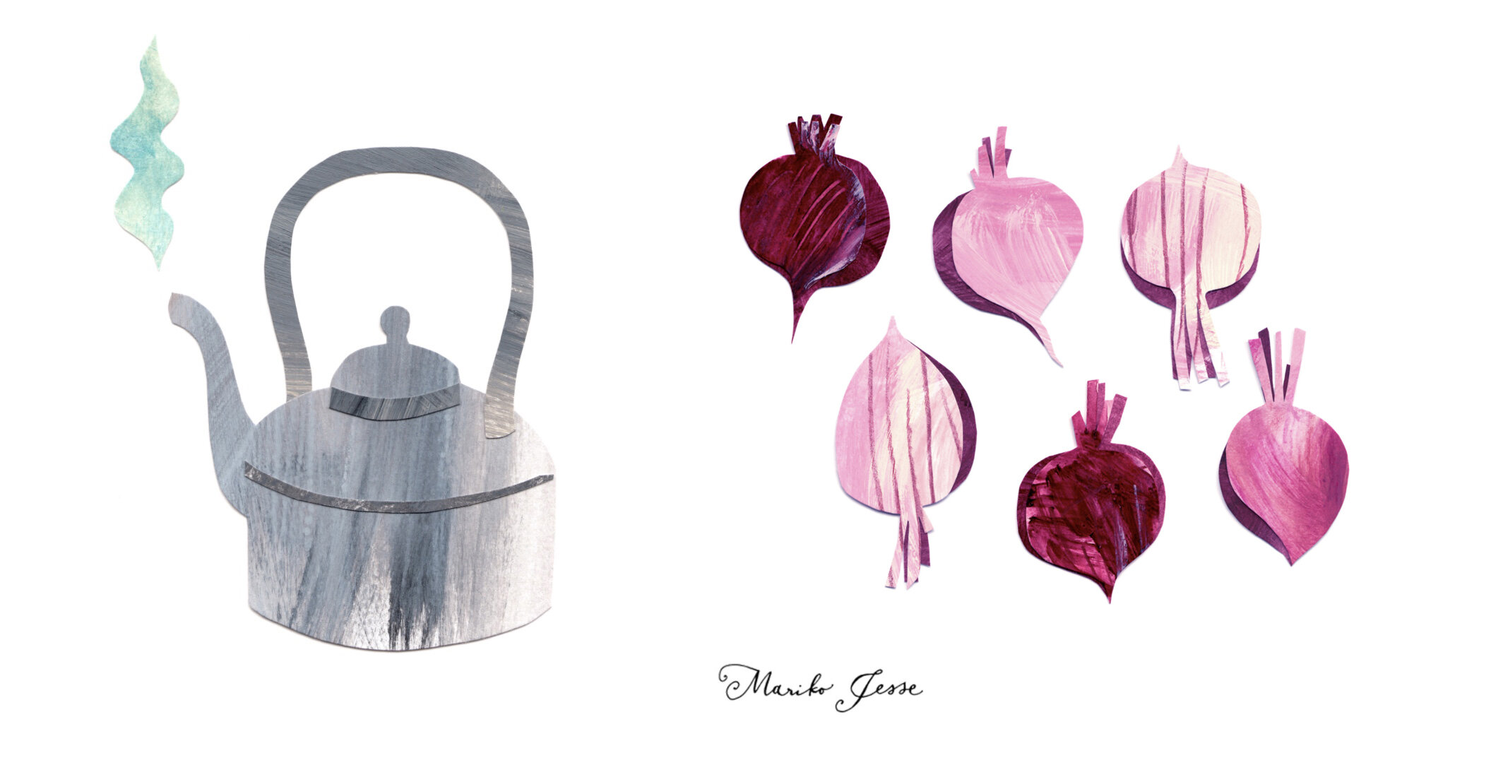
I experimented with his style, and moved away from the fragile tissue paper he preferred and used thick paper for my collage illustrations for the River Cottage much more veg cookbook. I wanted shadows on my images, to show depth, and so that you could see the physical layers of the paper. I chose an opaque look, over Eric’s transparent layering, but tried to capture some of his movement and texture in the paint and pencil marks.

ec i 1.JPG

I will forever be grateful for how Eric Carle changed children’s books, and for how he inspired me personally.

ec i 2.JPG

Thank you Mr Carle, for making the world a more beautiful place. RIP.

CMA promotional plates

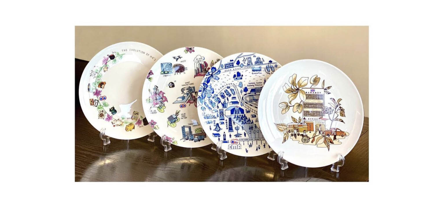
I recently did the illustrations for these promotional plates for the CMA in HK. Each plate represents a different era of their long history in HK, and the different areas they work in.

plates.jpg

My favourite to research and work on was the first plate, which showed the original CMA building in the 1950’s. I did it in sepia tones, with gold highlights, and loved drawing the old bus and lady with 1950’s hair!

old hk.jpg

I wove bauhinia flowers, the national flower of HK, into the designs of each of the four plates. The blue plate features the 1960’s trade shows of the CMA, the third plate features famous HK brands and products through the ages, and the last shows modern technology and science in HK today.

3 plates.jpg

Hong Kong visit

I'm in HK at the moment, for various projects, and just took part in the Symposium for Disaster Risk Reduction at the Hong Kong PolyU.Author Martha Keswick and I gave a presentation as part of the campaign for Disaster Risk preparedness, to launch our new childrens picture book series: 'COPE - How to be Ready for Natural Disasters'.It's a series of books featuring a team of kids who travel the world teaching other kids how to handle various natural disasters. The first book is about Earthquakes. We hope to eventually have books that include what to do in hurricanes, wildfires, floods, tsunamis, blizzards and volcanoes.Because of increasing climate change, natural disasters are becoming more prevalent, and it's so important that children know how to deal with them. We are actively looking for partners to help us publish and fund the series. If you know any NGOs who might be interested, please contact us! We have a temporary website here for more info:

www.COPE-natural-disasters.com

If these books can saves lives, I will feel like I've done something worthwhile. Please help if you can!

HOBBS USA

HOBBS of London, a boutique fashion brand I've done a bit of work for recently, famously known for being a favourite of Duchess Kate, has just opened their first US store in Greenwich Connecticut. I did several pieces of new artwork for both the store itself and its launch.Some of the artwork I did for the London stores, plus a few new pieces, have been printed and framed inside the elegant new location.I love the way the artwork has been mixed and matched and hung together in different combinations to create a 'collection'. Some has even been framed up for the changing rooms...I also did a detailed map of the area around the new store, full of interesting buildings, a park, and some historic houses......which is now framed up and on display.It looks like a wonderful store, I hope I'll get to visit one day. Thank you to Hobbs for providing these photos.

BEYORG organic market

This weekend I visited the BEYORG organic market pop-up store in Pacific Place mall, Hong Kong, to see the bags I designed for them.screen-shot-2016-10-29-at-12-41-50-pmIt's such a lovely idea, it was super fun to see! I love the way they animated my illustration in their instagram feed too: [embed]https://www.instagram.com/p/BLix95mlS5n/?taken-by=beyorg[/embed]

The little market stands are just how I imagined them...beyrg-photoand I think I captured the atmosphere of the market quite well...screen-shot-2016-10-29-at-12-54-38-pmHope you can pop down and see the market for yourself and buy a bag for charity!photo-beyrg

Animals Asia products

I was recently asked to design some products for the charity Animals Asia. These products are sold here and the profits go towards their work saving animals.tea-towelI painted illustrations of wonderful moonbears, as I really love them and can't stand the way they are farmed and treated so cruelly. I tried to show them being curious and adorable, and most of all, hopeful.tote-bag-stillI started the project by researching and sketching moonbears, and playing with ideas on how to bring some colour and fun into the images.bear-sketches-2 I then tried out different styles and media, and picked watercolour to give the illustrations a loose, free feeling.bear-sketches-1There's a teatowel, a tote bag and a tshirt, with different illustrations, and all available from the Animals Asia online shop.tshirtBuy them for all your friends! Please help save the bears!

HOBBS High Street Kensington part 2

The new HOBBS store in High Street Kensington, London is open! And lots of my specially commissioned illustrations are framed and decorating the walls...store 1I was asked to create illustrations for the stores, in a variety of styles, that reflected their values of quality and British heritage.store 2I also made a special map of the surrounding area showing the wonderful buildings and streets you can explore near the new store. HighstreetkenmapartworkI highlighted some of the HOBBS iconic fashion items...

fashion... and added in elements like local British flowers and animals.framesFoxgloves and sweetpeas, foxes and a stag...

16 foxgloves artwork... and of course a countryside feature, the pheasant!9 pheasant artworkI also did some hand-lettered quotes, some etchings, and included some pages from my sketchbooks.store 3I hope you'll be able to visit and let me know what you think. Happy shopping!

Thanks to Nick Jesse for the store photos.

HOBBS High Street Kensington

I recently did some artwork for HOBBS fashion stores in London. I produced over 20 illustrations for use inside their stores, and also one very special one for the promotion of their newest store in High Street Kensington, inside the iconic Barkers building. Here's the promo they made for instagram: [video width="640" height="640" m4v="http://www.marikojesse.com/blog/wp-content/uploads/2016/06/IMG_2885.m4v"][/video]


The illustration also went out on invites for VIPS and local customers...26646283513_b0a20b0c20_c...and I heard that a good time was had by all. Next post will have photos of the store!

colouring book

I recently illustrated my first colouring book pages. It was only four pages in a book that had many, but it was surprisingly complicated!c b pagesThere's so much detail involved, and all the lines need to match up nicely, and it should be interesting enough that you really look forward to colouring it in. Here's the flower shop as I drew it...cb1This vase and bouquet is my favourite detail from one of the other pages...detailYou can buy the book on amazon. Don't forget to show me your coloured pages when you're done ~ I'd love to see how they look.

kapok 10 year anniversary

kapok, the hipster boutique lifestyle store in Hong Kong had their ten year anniversary this weekend, and they've been building up to it with a variety of events. I designed and illustrated a map for their #kapok10 anniversary launch, and they've used elements from it throughout their stores, website and social media.kapok 10 productsI've never created a map from scratch before, by which I mean that it's an imaginary place, not a real one. I was asked to create a country that embodied everything kapok stood for: creativity, fun, fashion and a truly international flavour. I could start anywhere! And of course a new country needs a crest: kapokland's features the pink dolphin of HK and their new motto: 'future classics'crest Here's the full map, showing an archipelago of different exotic fantasy islands, covering all seasons at once, with both tropical and arctic lands.kapoklandThe reverse side of the map also featured a close-up of the main town in kapokland: Kapokville. The town had shops and museums, but also global embassies, a castle and even pedalos!town mapThis is how it was used on the kapok website...kapok homepageThey even had a stand at a local design market with fun illustrated props for customers to interact with...stall...and also used some of the animals as a banner on facebook...kapok banner copyI especially liked how they used details from the map on the store windows...kapok wholw windowand inside...kapok10 in windowCongratulations kapok! Here's to the next 10 years of fabulous!

Dr Oz Magazine

I did some chalk drawing backdrops a few months ago for Dr Oz The Good Life Magazine in New York, and I just got a printed copy, yay!blueI love this one with the frosty blue colour and wintery trees. Here's a detail of the actual backdrop, where you can see the chalky lines.And here's a sequence showing my progress as I was drawing.winter park scene in progress copyFor the home interior, I started with a more elaborate staircase, but developed my sketches to create a simpler scene. stairway roughsI even drew a simplified version of one of my own prints in the background ... pinkIt was a real pleasure to be there on the day of the shoot, here's a little scene of me sketching the set-up.model sketchLet's all walk more this year and get healthy, whatever the background...

kapok shop window displays

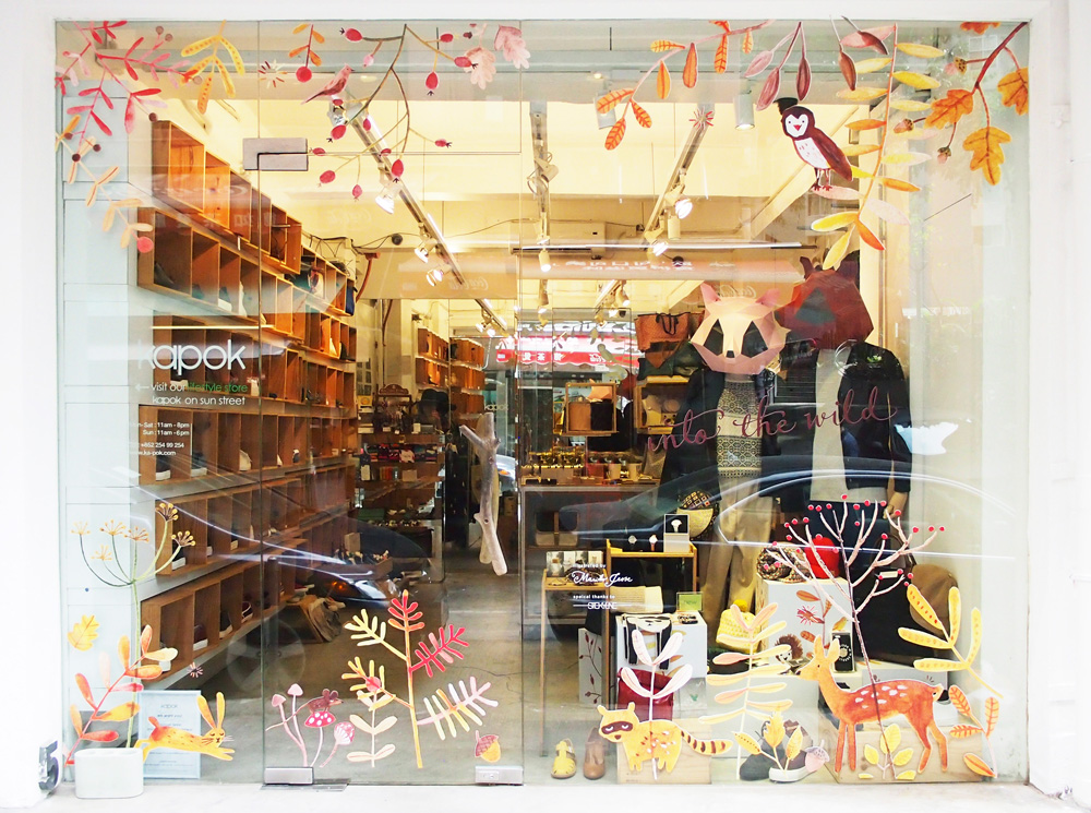
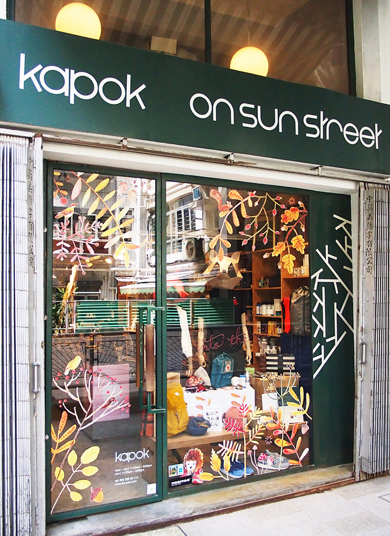
I recently designed an autumn window display theme for kapok in Hong Kong. I created watercolour illustrations in shades of reds and browns for their 'into the wild' theme, featuring foliage, berries, and cute woodland animals. OLYMPUS DIGITAL CAMERA

I created various layouts of the illustrations for the six different store locations.

OLYMPUS DIGITAL CAMERA

Kapok has two stand alone stores in Wanchai, one large one in PMQ in Central,PMQ 2 copy and several concession stores within department stores,kapok voyage copyso they all needed slightly different treatments. I love the cube stands and little details inside the stores too...store copyHere's to a happy Autumn!mouse