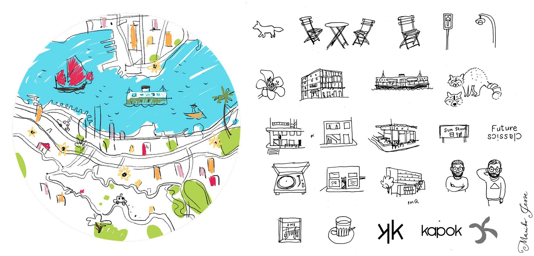
kapok, the hipster boutique lifestyle store in Hong Kong had their ten year anniversary this weekend, and they've been building up to it with a variety of events. I designed and illustrated a map for their #kapok10 anniversary launch, and they've used elements from it throughout their stores, website and social media. I've never created a map from scratch before, by which I mean that it's an imaginary place, not a real one. I was asked to create a country that embodied everything kapok stood for: creativity, fun, fashion and a truly international flavour. I could start anywhere! And of course a new country needs a crest: kapokland's features the pink dolphin of HK and their new motto: 'future classics'
 Here's the full map, showing an archipelago of different exotic fantasy islands, covering all seasons at once, with both tropical and arctic lands.
 The reverse side of the map also featured a close-up of the main town in kapokland: Kapokville. The town had shops and museums, but also global embassies, a castle and even pedalos!
 This is how it was used on the kapok website...
 They even had a stand at a local design market with fun illustrated props for customers to interact with...
 ...and also used some of the animals as a banner on facebook...
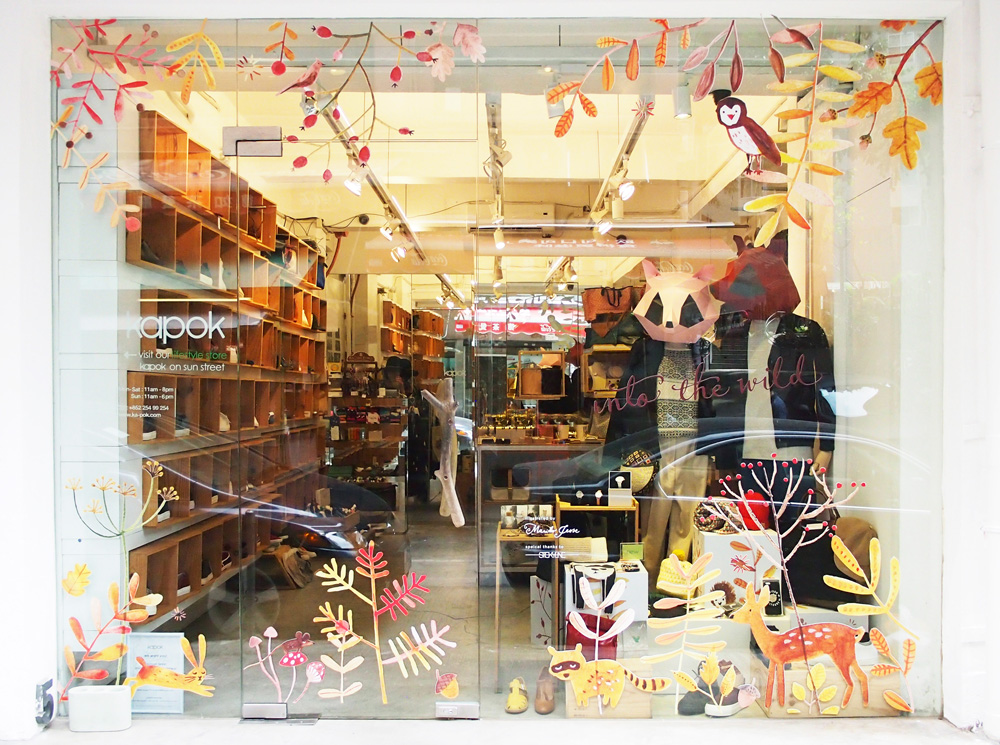
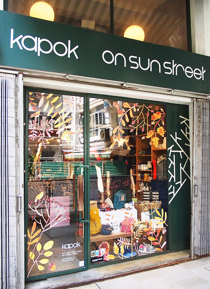
 I especially liked how they used details from the map on the store windows...
 and inside...
 Congratulations kapok! Here's to the next 10 years of fabulous!



 They even had a stand at a local design market with fun illustrated props for customers to interact with...


