It's that time again! I'm showing lots of prints, both old and brand new, in my San Francisco Dogpatch workshop. Please come and visit us and buy art direct from the artists. Here's a sneak peak of some of my framed prints up on the wall...
advertising
animals asia Christmas cards
I've designed some Christmas cards for my favourite animal charity again this year, Animals Asia. I worked on lots of different ideas, and three were chosen for the cards. I tried to make them cute, but not too cute...
 If you're considering buying some charity cards, please help us help the moonbears!
  You can buy the cards here. Thank you!!
Labour Day sale
Here in the US it's labo(u)r day on monday, so I've put all my prints on sale for 4 days, from today. Hurrah! Please visit my shop here to take a look...
calligraphy
I did a little calligraphy job this week, for Van Cleef & Arpels in Hong Kong, for a press launch of their new collection. I hand-wrote place-cards for the invited journalists in a pretty, delicate style. I was also on location during the event, to write any cards for unexpected guests, and while I waited, I sketched the pretty PR ladies.
women who draw
I'm very proud to be a part of the women who draw website, an open directory of female professional freelance illustrators, artists and cartoonists. It was created by a group of women artists in an effort to increase the visibility of female illustrators. You can read all about it here and in this VOGUE article and in this one in the Huffington Post.
This is my little lady illustration (recognise her from the Miss joker playing card?) that represents me on the site. She was even featured on the BBC news website this week, in an interview with the women who set up the site. I hope it will be a huge success. Thank you Wendy and Julia!
Discovery magazine
open studios 2016
Yes, it's that time again! I'll be showing prints at my workshop in Dogpatch, San Francisco, as part of the City's ArtSpan openstudio weekends.  I'll be showing a selection of framed works, ready to hang:
 ...and a variety of new unframed prints, such as these:
 I'll have some new mokuhanga prints,
 ...and new playing cards:
 I'll be showing with 7 of my studio-mates over the weekend of 22/23 October. 11-6pm both days. I hope to see you there!
HOBBS High Street Kensington
I recently did some artwork for HOBBS fashion stores in London. I produced over 20 illustrations for use inside their stores, and also one very special one for the promotion of their newest store in High Street Kensington, inside the iconic Barkers building. Here's the promo they made for instagram: [video width="640" height="640" m4v="http://www.marikojesse.com/blog/wp-content/uploads/2016/06/IMG_2885.m4v"][/video]
The illustration also went out on invites for VIPS and local customers... ...and I heard that a good time was had by all. Next post will have photos of the store!
kapok 10 year anniversary
kapok, the hipster boutique lifestyle store in Hong Kong had their ten year anniversary this weekend, and they've been building up to it with a variety of events. I designed and illustrated a map for their #kapok10 anniversary launch, and they've used elements from it throughout their stores, website and social media. I've never created a map from scratch before, by which I mean that it's an imaginary place, not a real one. I was asked to create a country that embodied everything kapok stood for: creativity, fun, fashion and a truly international flavour. I could start anywhere! And of course a new country needs a crest: kapokland's features the pink dolphin of HK and their new motto: 'future classics'
 Here's the full map, showing an archipelago of different exotic fantasy islands, covering all seasons at once, with both tropical and arctic lands.
 The reverse side of the map also featured a close-up of the main town in kapokland: Kapokville. The town had shops and museums, but also global embassies, a castle and even pedalos!
 This is how it was used on the kapok website...
 They even had a stand at a local design market with fun illustrated props for customers to interact with...
 ...and also used some of the animals as a banner on facebook...
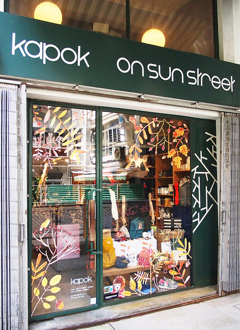
 I especially liked how they used details from the map on the store windows...
 and inside...
 Congratulations kapok! Here's to the next 10 years of fabulous!
tmtplaza beauty promotion
I recently designed an exclusive butterfly and peony pattern for a jewellery box for tmtplaza in Hong Kong, for their spring beauty promotion. I was asked to create something feminine and elegant, to match with this season's beauty products and cosmetics.
 The illustration started out as pencil sketches of peonies in pale colours, with detailed monochrome butterflies and shadows.
 This then gradually turned into a more colourful solid background with smaller butterflies...
 ...and I then developed the butterflies into more colourful versions, with stronger patterns and outlines. I chose a limited colour palette of pinks and greens to give the feminine feeling a contemporary twist.
 I tried more detailed peonies, in richer colours...
 ...but in the end it went with the paler, more loosely-drawn flowers and more fully detailed butterflies.
  If you spend over HK$1,500 at the mall, from 23 April, you can get my box as a VIP gift, while stocks last! Hurry!
kapok shop window displays
I recently designed an autumn window display theme for kapok in Hong Kong. I created watercolour illustrations in shades of reds and browns for their 'into the wild' theme, featuring foliage, berries, and cute woodland animals.
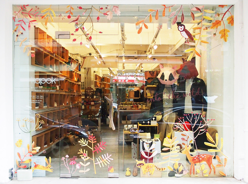
I created various layouts of the illustrations for the six different store locations.
Kapok has two stand alone stores in Wanchai, one large one in PMQ in Central, and several concession stores within department stores,
 so they all needed slightly different treatments. I love the cube stands and little details inside the stores too...
 Here's to a happy Autumn!
year of the goat
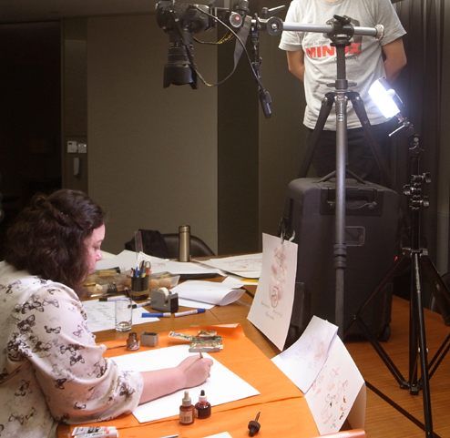
Here's a video of me drawing a happy new year goat. It was made as part of the social media campaign for Pacific Place mall in HK. It's a visual pun on a traditional Chinese blessing about the rabbit's breath and the goat's eyebrows, which somehow translates to good fortune! https://vimeo.com/119728675
I did pencil sketches first to work out the order in which to draw things, how the goat should look, and the positioning of drawing and text. This is how the final goat looks in ink and watercolour...
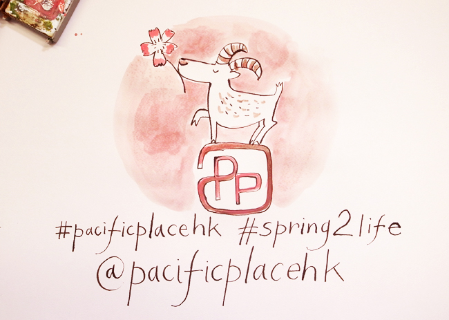 And this is the filming. I drew at my normal speed, but tried to keep it generally consistent, and the final footage was speeded up, and a soundtrack added. I've never done this before, but it was fun!
Pacific Place
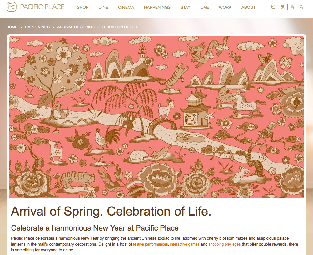
I've just arrived in HK to do some promotional work for Pacific Place luxury shopping mall. I created an illustration about the celebration of Spring, for their Chinese New Year decorations. I used red (a lucky & auspicious colour) and included all the 12 Chinese horoscope animals. It also features Chinese New Year elements such as peonies, plum blossoms and pine trees.
The PP website features the design in a pink + brown colour combination.
 There'll be all kinds of fun events at Pacific Place over Chinese New Year, so if you're around, please check it out! I'll be taking some photos of the decorated mall this week, so you can see those soon.
It's the year of the goat, and I especially do like drawing goats...
Waitrose Christmas
For this year's Waitrose Christmas magazine in the UK, I drew images that would be used as backdrops for the hampers special photoshoot. I created the illustrations, but as I couldn't be on location, a specialist did the physical chalk drawings onto boards on my behalf. I think they turned out pretty well!
 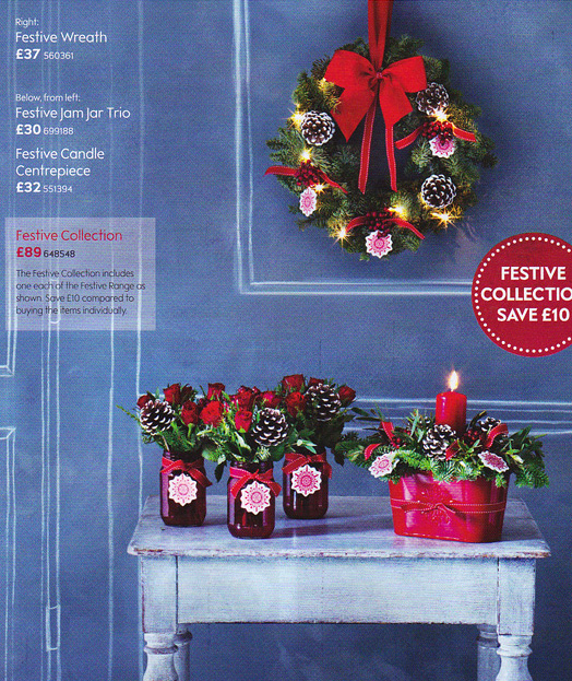 Pick up a copy in any Waitrose to see them all!
First Merit Bank adverts 2
The hand-drawn animated TV adverts I did for First Merit Bank with Brokaw in the US last year were so popular, they asked for more! And here they are. Enjoy!
