I recently illustrated a small map of Vermont for Middlebury Magazine. It's a lovely little article about the author's annual journey to Bread Loaf.  I think it's always interesting to see how an illustration starts, so these are the initial sketches I made when I was thinking about how to approach the project. The first sketch, which I ended up working with, shows the map from an aerial bird-eye view, and the entire route. The second sketch shows the road to Bread Loaf in a more 3 dimensional way, although some of the road is hidden behind hills...
 I take the page layout into consideration when I work, so it makes me happy to see everything come together nicely on the printed page.
map
HOBBS USA
HOBBS of London, a boutique fashion brand I've done a bit of work for recently, famously known for being a favourite of Duchess Kate, has just opened their first US store in Greenwich Connecticut. I did several pieces of new artwork for both the store itself and its launch. Some of the artwork I did for the London stores, plus a few new pieces, have been printed and framed inside the elegant new location.
 I love the way the artwork has been mixed and matched and hung together in different combinations to create a 'collection'. Some has even been framed up for the changing rooms...
 I also did a detailed map of the area around the new store, full of interesting buildings, a park, and some historic houses...
 ...which is now framed up and on display.
 It looks like a wonderful store, I hope I'll get to visit one day.
  Thank you to Hobbs for providing these photos.
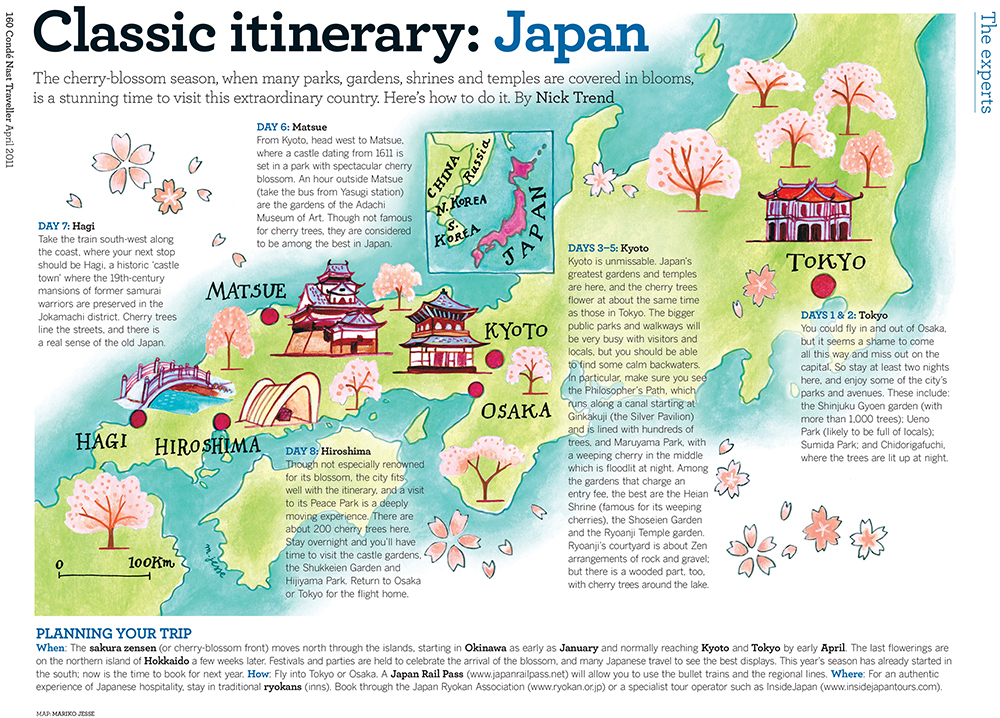
Japan map
I've been planning some trips for the year, and trying to decide where to go, so I've been looking through some of the old maps I did for Conde Nast Traveller for inspiration. I found this full page map of Japan in the cherry blossom... and am thinking it might be just the ticket!
Rio map
HOBBS High Street Kensington part 2
The new HOBBS store in High Street Kensington, London is open! And lots of my specially commissioned illustrations are framed and decorating the walls... I was asked to create illustrations for the stores, in a variety of styles, that reflected their values of quality and British heritage.
 I also made a special map of the surrounding area showing the wonderful buildings and streets you can explore near the new store.
 I highlighted some of the HOBBS iconic fashion items...
 ... and added in elements like local British flowers and animals.
 Foxgloves and sweetpeas, foxes and a stag...
 ... and of course a countryside feature, the pheasant!
 I also did some hand-lettered quotes, some etchings, and included some pages from my sketchbooks.
 I hope you'll be able to visit and let me know what you think. Happy shopping!
Thanks to Nick Jesse for the store photos.
kapok 10 year anniversary
kapok, the hipster boutique lifestyle store in Hong Kong had their ten year anniversary this weekend, and they've been building up to it with a variety of events. I designed and illustrated a map for their #kapok10 anniversary launch, and they've used elements from it throughout their stores, website and social media. I've never created a map from scratch before, by which I mean that it's an imaginary place, not a real one. I was asked to create a country that embodied everything kapok stood for: creativity, fun, fashion and a truly international flavour. I could start anywhere! And of course a new country needs a crest: kapokland's features the pink dolphin of HK and their new motto: 'future classics'
 Here's the full map, showing an archipelago of different exotic fantasy islands, covering all seasons at once, with both tropical and arctic lands.
 The reverse side of the map also featured a close-up of the main town in kapokland: Kapokville. The town had shops and museums, but also global embassies, a castle and even pedalos!
 This is how it was used on the kapok website...
 They even had a stand at a local design market with fun illustrated props for customers to interact with...
 ...and also used some of the animals as a banner on facebook...
 I especially liked how they used details from the map on the store windows...
 and inside...
 Congratulations kapok! Here's to the next 10 years of fabulous!
Sicily map
I haven't featured any maps recently, so I thought I'd show this map of Sicily I did for Conde Nast Traveller in the UK . I painted it a while ago, and I like the way it's placed in the page, giving it lots of room to breathe. I also thought I'd show my rough sketch for the map:
 You can see how the outer shape of the sea around the island has changed, and a few things, like the distance scale, have moved, and that I removed all the tiny outer islands. The final map became more streamlined, and focussed on the important elements. The bright Mediterannean colours were wonderful to paint.
Puerto Rico map
I've been doing city and country maps for PCMA Convene magazine in the US for quite a while, and for the most recent issue, I did a clean, bright, minimal map of Puerto Rico, highlighting a few places with black & white pencil icons.
Chicago Magazine
I've illustrated a fun map in the current issue of Chicago magazine, about places to day-trip around Chicago. It features all sorts of interesting stuff, like lighthouses and famous ice-cream parlours! I also created some little icons that were used throughout the whole road-trip article...
Conde Nast Traveller map
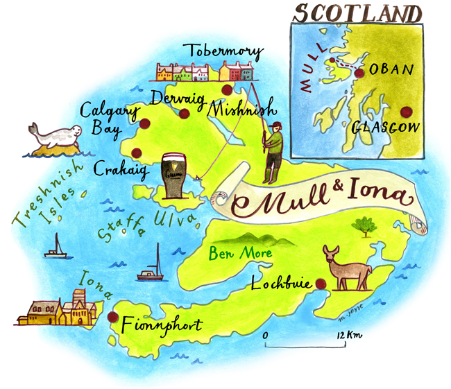
map of Mull & Iona
I create maps quite regularly for the travel section of the CSMA Club magazine in the UK. They feature places to stay, things to see, and often lovely local edible specialities. Here's a map I did for them of a Scottish walking tour.
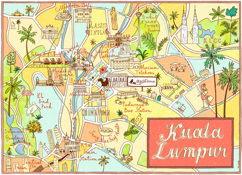
LOKL cafe map
I was commissioned to create a decorative sight-seeing map of Kuala Lumpur, for LOKL, a boutique coffee shop there. The brief was for it to be colourful, fun, a bit modern-retro, and to show all the great things to do in KL... Here are some photos of the framed map on the wall. The cafe is attached to a fantastic little modern back-packer place called BackHome.


wedding invitations
So, my good friend Ping got married this May, and I designed his wedding invitations, and also created a special map for him of Central Park in NY (where he made his romantic proposal). The style brief for the invitation was a vintage, country feel, with a quirky, hand-made aesthetic; light-bulbs hanging from wooden rafters and flowers in jam jars, that sort of thing.
I created a simple, hand-lettered invitation, in two slightly retro colours, with a few illustrative details. Inside, the card was also hand-lettered.

 The card design was used as a detail throughout the wedding, with cards on the tables as menus, place settings and memory cards, where everyone could write notes for the bridal couple and hang them up on a washing line...
The map I created for them was a narrative of where they walked that day, where Ping hesitated, where they got lost, and where he finally proposed.
 It was used as an animated feature in a mini-movie of the wedding, and also as a back-drop for the stage at the reception:
*the photographs were taken by Tec Petaja


