Designing and illustrating for my own wedding has been a pleasure. Stressful, but full of joy too. I created all the stationery first, with a green/pink/brown/white colour palette, and occasional border of green watercolour leaves, and then carried this through all the wedding elements. Simplicity was the key to everything.
 The reception was held at the Black Barn, in Berkshire (UK), a huge barn on a working farm, and a delightful setting for a perfect day. They don't have many weddings there, and I was free to create everything just how I wanted it...
 My brother Kenji was in charge of the bar (he's a drinks specialist) and he created a welcome punch for the guests, with watermelon hearts on the glasses, and special cocktails for the evening.
  I made the signage for both in the wedding colours.
 My friend Karen made bunting out of different shaped paper doilies and green ribbon, which we hung inside and outside the barn. I had lots of fun with the flowers, which I bought from New Covent Garden market and arranged with my mum, in my personal collection of vintage bottles, jars, and white ceramic jugs.
  The interior of the barn still takes my breath away. I wanted it to be pretty, welcoming, and sparkling, and retain the essential "barn-ness" of the venue itself. To create a glowing atmosphere, I used festoon lights for the ceiling, hung by the amazing James and Chris of acdisco, and smaller pinlights from thinkgadgets for the columns. My friend Alvin, of YMK design, oversaw all the technical aspects of the styling and installation.
 I painted the seating plan as vines with leaves, in the U shape of the table layout.
 In the entrance to the barn, photos hung on twine with wooden pegs (along with some framed photos of the bride & groom). Alvin took fun photos at the wedding with a mini polaroid camera, and these were also hung up for everyone to see.
 On the opposite side of the entrance was the centre-piece of the reception: the cake table. Friends brought hand-made cakes, meringues and puddings, and my friend Anna styled the table to look irresistible.
 I made hand-written doilie labels for the desserts, with the baker's name, aswell as the type of cake. I also made doilie candles in various heights, containing battery-operated tealights, for all the tables. Our official photographer Sonja Read took these beautiful photos of the cake table.
 My dad made our gorgeous wedding cake; three tiers of homemade fruit cake heaven...
 At the end of the cake table was a mini sweet shop. Everything came from my favourite treat website, Chorley & Baker. We had sugared almonds, milk bottles, gummy hearts, and apple bon-bons, all chosen with the wedding colours in mind.
 My friend Alex at ChocoYou even made delicious little hand-made chocolates with an edible version of my vignette illustration on them!
 My dad also made some lovely wine bottle labels, using elements of my illustrations. Each label had a portrait of us, and a quote about love.
 The amazing Street Kitchen provided the catering. They parked their airstream just outside the barn, and everyone went up to collect their food. For the main course, I used eco-friendly plates that matched the barn, that we could recycle,
 and for the desserts, I gave each guest a personalised vintage side plate. They doubled as place settings and wedding favours, and were such fun to make.
 I bought plates from Portobello market, thrift stores in San Francisco, and charity shops all over London, and then created a dotty calligaphy font in ceramic paint, which could be baked on, to become permanent.
 It was our dream wedding, and I'd like to thank everyone who helped us with all the planning, designing, installation and clean-up (especially Johan, our wonderful DJ friend). It simply wouldn't have been possible without the help of all our friends and family.
Everything was perfect, and I'm full of love for all of you...especially my adorable new husband.
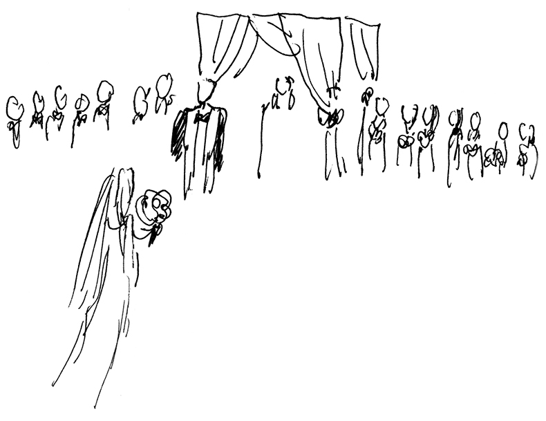
 I sketched as much as I could, and loved seeing how my designs were used on the day.
For Luke & Amy's wedding stationery, I started with an illustration of the happy couple on a London bus, with pink flowers in the background, which was used for the Save the Dates. I started them off in casual clothes, and added a simple hand-drawn pink border around the card.
I sketched as much as I could, and loved seeing how my designs were used on the day.
For Luke & Amy's wedding stationery, I started with an illustration of the happy couple on a London bus, with pink flowers in the background, which was used for the Save the Dates. I started them off in casual clothes, and added a simple hand-drawn pink border around the card. I developed this motif and drew a more detailed background for the formal invitation, including important places from their life together and secret elements from the wedding reception, like the ice-cream cart, the bowling pin and neon arrow, to hint at what would be in store on the day. I also put them in more traditional wedding attire.
 For the welcome reception, before the wedding, I created a simpler version of the illustration, with a celebratory bottle of champagne...
 ....and then for all of the other stationery, another version with just a few of the details from the full invitation illustration.
 It was used on the menu
 for the wedding lunch, which was delicious, and the table where I sat was full of interesting and beautiful people to draw.
 There was dancing and cocktails...
 and an awesome sweet bar: check out the sweet bags!
  I hadn't seen this, but the bride was given a special dressing gown with the illustration embroidered onto the back. Isn't it amazing!
 I also made a square-bordered version of the illustration (with an added heart detail) to have printed onto a pillow for the bride and groom as a gift.
 I have more drawings of the day, but this is my favourite of the bride, my new sister-in-law. Welcome to the family!


