I recently illustrated a small map of Vermont for Middlebury Magazine. It's a lovely little article about the author's annual journey to Bread Loaf.  I think it's always interesting to see how an illustration starts, so these are the initial sketches I made when I was thinking about how to approach the project. The first sketch, which I ended up working with, shows the map from an aerial bird-eye view, and the entire route. The second sketch shows the road to Bread Loaf in a more 3 dimensional way, although some of the road is hidden behind hills...
 I take the page layout into consideration when I work, so it makes me happy to see everything come together nicely on the printed page.
editorial
Japan map
I've been planning some trips for the year, and trying to decide where to go, so I've been looking through some of the old maps I did for Conde Nast Traveller for inspiration. I found this full page map of Japan in the cherry blossom...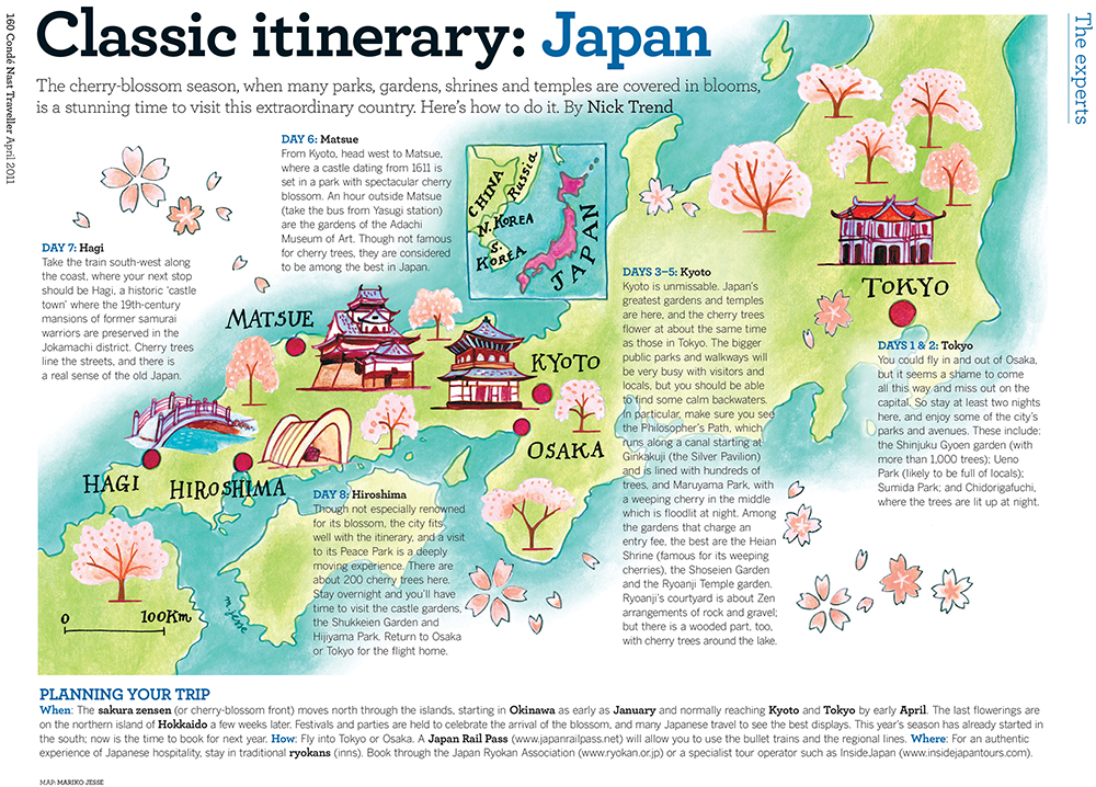 and am thinking it might be just the ticket!
Discovery magazine
I recently managed to get a copy of Cathay Pacific's inflight magazine featuring my HK toile bowl on the cover. They even gave me a nice little write up inside...
 I still love this toile so much, and am thinking of doing another...
Rio map
To celebrate the start of the 2016 Olympics, here's a map of Rio I did for Conde Nast Traveller a few years ago. Hope it goes super well! I did a few little Rio icons for the article too...
![]()
print exchange
I took part in a print exchange between my own print studio the Graphic Arts Workshop and the Print Club of Rochester which is now on show in the GAW gallery. There was no specific theme, so I decided to do a new playing card in my ongoing series. I sketched all sorts of wading birds and chose sandpipers doing a spot of fishing.
The opening reception is this afternoon 3-5pm, please do pop in if you can!
I sketched all sorts of wading birds and chose sandpipers doing a spot of fishing.
The opening reception is this afternoon 3-5pm, please do pop in if you can!
 Here's how they look on the walls...
colouring book
I recently illustrated my first colouring book pages. It was only four pages in a book that had many, but it was surprisingly complicated! There's so much detail involved, and all the lines need to match up nicely, and it should be interesting enough that you really look forward to colouring it in. Here's the flower shop as I drew it...
 This vase and bouquet is my favourite detail from one of the other pages...
 You can buy the book on amazon. Don't forget to show me your coloured pages when you're done ~ I'd love to see how they look.
RAYKO photography exhibition
in competitions, editorial, exhibitions, lifestyle, travel, USA
I have a photograph in the annual juried plastic camera show at RAYKO in San Francisco, and I popped in to see it last week. So exciting!  I'm always taking photos on my holga/Lomo/Olympus Pen and don't show them enough. It's inspiring to see so many people making beautiful images on their plastic, almost toy, cameras.
 I recommend checking it out! The exhibition is up for one more week, until April 29th.
Rayko, 428 Third Street, SF, CA 94107
I recommend checking it out! The exhibition is up for one more week, until April 29th.
Rayko, 428 Third Street, SF, CA 94107
interview
in editorial, illustration, lifestyle, press
I did an interview with playtimes magazine when I was in HK, mainly to promote the Max and Mei books I illustrated. It's funny to read what I said, in another person's words:
 They collected together some of my images for the interview, and I love seeing how other people put them together, it always surprises me.
 You can read the whole interview at the Playtimes link above, and see the Max and Mei books here.
Click magazine
I did a fun illustration for the current issue of Click magazine, for their photo contest page, with all sorts of pets. Which one is your style? I like the layout of the online mag a lot...
 Hope you all enter the contest!
Dr Oz Magazine
I did some chalk drawing backdrops a few months ago for Dr Oz The Good Life Magazine in New York, and I just got a printed copy, yay! I love this one with the frosty blue colour and wintery trees. Here's a detail of the actual backdrop, where you can see the chalky lines.
 And here's a sequence showing my progress as I was drawing.
 For the home interior, I started with a more elaborate staircase, but developed my sketches to create a simpler scene.
  I even drew a simplified version of one of my own prints in the background ...
 It was a real pleasure to be there on the day of the shoot, here's a little scene of me sketching the set-up.
 Let's all walk more this year and get healthy, whatever the background...
New York trip
I just got back from a quick trip to New York, where I worked on a lovely project for Dr Oz The Good Life magazine. I can't show you what it was yet, but here's a sketch I drew on the photoshoot day.  I also drew the model several times, in various of her outfits...
 The view from the studio was gorgeous, so New York!
 I had a fantastic dinner one evening at the Brooklyn Diner, and sketched while I was waiting. The waitress was so happy with the sketch that she gave me a bag of delicious pastries to take home with me!
 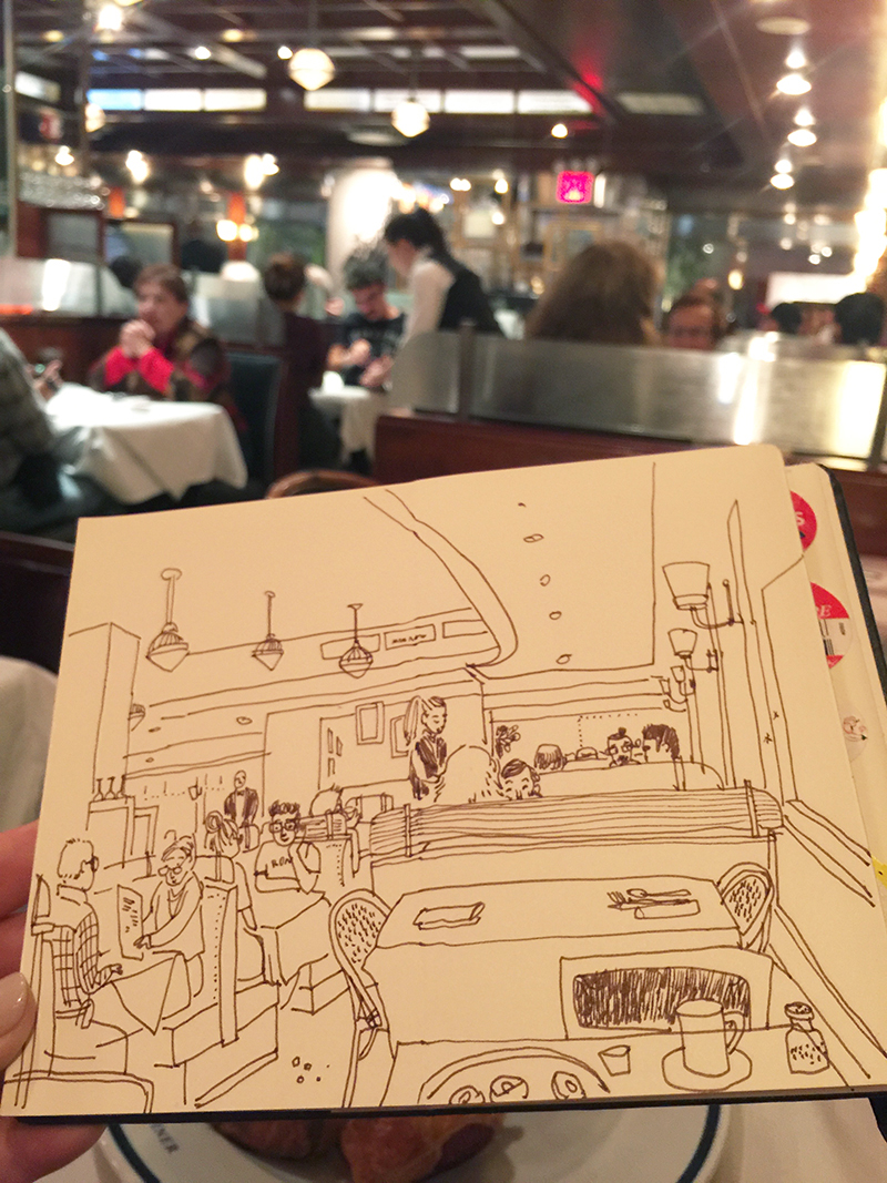 I love New York, I really do. I'll be back soon, just you wait and see...
Sicily map
I haven't featured any maps recently, so I thought I'd show this map of Sicily I did for Conde Nast Traveller in the UK . I painted it a while ago, and I like the way it's placed in the page, giving it lots of room to breathe. I also thought I'd show my rough sketch for the map:
 You can see how the outer shape of the sea around the island has changed, and a few things, like the distance scale, have moved, and that I removed all the tiny outer islands. The final map became more streamlined, and focussed on the important elements. The bright Mediterannean colours were wonderful to paint.
Washington Flyer
I did some nice grainy line illustrations for the magazine Washington Flyer this month. It's their holiday gift special... You can see the full issue here.
 It was fun to design the wallpaper pattern, and also fun to start thinking about Christmas. I love the holiday season!
Puerto Rico map
I've been doing city and country maps for PCMA Convene magazine in the US for quite a while, and for the most recent issue, I did a clean, bright, minimal map of Puerto Rico, highlighting a few places with black & white pencil icons.
ICON 8
in animation, design, drawings, editorial, illustration, photography, sketchbooks, travel, USA
I attended ICON 8 the illustration conference in Portland last week, and had a wonderful time. I met some amazing and inspirational illustrators, and learned alot about things every illustrator should know. I especially enjoyed meeting Carson Ellis,  Jon Klassen (who did 'This is not my hat'), Leo Espinosa, and Vivienne Flesher (a true illustration icon!)
 all of whose work I totally adore. There were just so many great speakers...
 I visited the animation studios of Laika, and got to play with some of the characters and props used in the Boxtrolls movie. I especially liked Coraline...
 ... and of course Portland itself was super to explore.
 I especially enjoyed the doughnuts!
Bastille Day
Here's a fun French style piece for Atlanta magazine, to celebrate Bastille Day. I tried to think of all the wonderful French things I could, to decorate the page.  Joyeux Quatorze Juillet!
HOKK fabrica interview
I was interviewed for the online fashion & lifestyle magazine Hokk fabrica this month. You can see the full interview here. This month's issue is about the concept of 'local', and they sent me questions which I was asked to answer by hand, like this... I was asked about my first memorable piece of artwork...
 It's a print I did in Japan. I really love it.
 Take a look at the full interview and hope you enjoy!
Chicago Magazine
I've illustrated a fun map in the current issue of Chicago magazine, about places to day-trip around Chicago. It features all sorts of interesting stuff, like lighthouses and famous ice-cream parlours! I also created some little icons that were used throughout the whole road-trip article...
Christmas drinks
I drew some festive line decorations around seasonal wine bottles for Waitrose supermarket's free Christmas drinks guide this year. I created a green-on-green patterned wallpaper for the background, so the white lines would pop, and the lovely rich colours of the wine bottles would sparkle.
 You can pick up the guides in any Waitrose around the UK!
yoga journal
Here are a few nice white line illustrations I did for Yoga Journal a while ago.  They are sort of back-drops, but more atmospheric than realistic. I just love the fish and coral!
 I tried to get a nice rich white chalky line quality,
  and did all sorts of sea creatures to follow through the underwater summer theme.