Today I'll be talking you through my portfolio: how I've divided and sub-divided the sections and why.
The first section is 'editorial'. This features illustrations I've done for magazines and newspapers. I've split this into several themes: 'food', because I like doing work on this subject the most, 'lifestyle', because so much fits under its umbrella, 'people', because they’re always engaging and 'horoscopes', as every illustrator quite simply must have one.
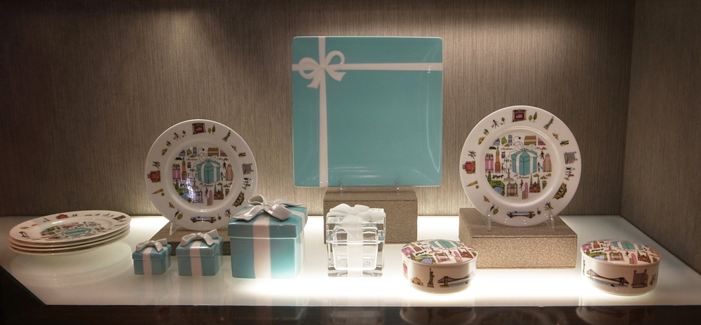
 The next section is 'special commissions'. This contains projects that are unique and don't necessarily fit easily into any fixed category. These are the projects I love best. Among them are ceramics for Tiffany & Co., backdrops for a photoshoot for Martha Stewart Weddings, and drawings on napkins for a charity exhibition.

'books' features all the large publishing projects I've worked on, from the detailed illustrations throughout the River Cottage everyday cookbook, to the many children's books I've illustrated, finishing with my book covers for various international novels.
I've been making maps for many years, almost from the beginning of my career, and the 'map' section shows a highlight of the various kinds: 'large scale' shows maps that are close-up and detailed, with road names and exact locations. 'small scale' tends to be maps of large areas, or whole countries, where capturing the atmosphere is most important. 'Penline' shows maps with a looser line, in a more graphic style, while 'concept' features more unusual maps, with a specific angle.
'editions' showcases my art prints: etchings (of ceramics and travel), Japanese woodblock prints, lithographs, and also a small selection of my medium-format photographs.

The section entitled 'personal work' shows the more intimate side of what I do. Sketchbooks are my constant companions, where all that I see and think are noted for future reference. 'things I've made' are objects I create, decorate and make interesting, 'greetings cards' is where I show the special cards I've designed, while 'exhibitions' contains photographs of the shows I've had of my work.
'about' tells you a little about me (you can see what I look like too), 'clients' is a list of some of the people I've worked for, and 'contact' tells you how you can find me to tell me, well, anything you'd like really. Or better still, that you'd like to commission me for something....
Oh, there's also a discreet 'links' button at the bottom of the page to let you know other websites I like.
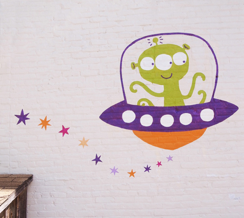
 They're using the ‘Sparky’ character I designed as the store mascot and logo now too. You can even get mini stick-on tattoos with him on!
 I went to Pennsylvania to visit some friends in the countryside,
 ...went to a cool gig of a guy called Stephan Said, who had all sorts of interesting-looking people accompanying him,
 and finally, enjoyed wandering in the Union Square farmer's market, looking at pies. A wonderful end to a wonderful trip.


