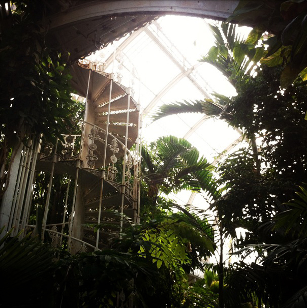
A lovely visit to Kew in London this week, with sunshiny picnicking on the lawns... The geese were very tame (or maybe just hungry), but with lovely shiny feathers!
 I absolutely adore the Palm House, with its Victorian architecture and glorious hothouse splendour. The wrought-iron staircase is rustily beautiful.
drawings
Bonaveri showroom
I illustrated a branch of plum blossom for the Spring launch of the new aloof mannequin from Bonaveri, for their China showroom.  I kept the colours bright and the line crisp, to create a calm and beautiful backdrop for the elegant new mannequins.
 My illustration is influenced by traditional Chinese painting, but I tried to give it a modern feel. I started with pencil sketches of the flowers, and then drew the line in dip-pen and ink, finally adding colour in Photoshop.
Santa Cruz
Golden State Warriors
This weekend we went to watch the Golden State Warriors play the Detroit Pistons in Oakland. I've never been to a basketball game before, but it was amazing fun, and it's possibly the fastest sport I've tried to sketch!
 Go Warriors!
Mission window display
I've just installed a display in the artspace window next to Alleycat Books in the Mission in San Francisco, on 24th and Treat. I wanted to create the illusion of looking into an interior, playing with various layers and dimensions. I drew an illustrated black and white backdrop of a Victorian parlour, looking through to several more rooms. I hid little details in the drawing to create stories: portraits, a lady by the fire, a statue of a rabbit, a cat’s tail, a stuffed bird under a glass dome. I played with depth within the drawing itself, and then added to it by hanging real framed pictures on the drawn walls.
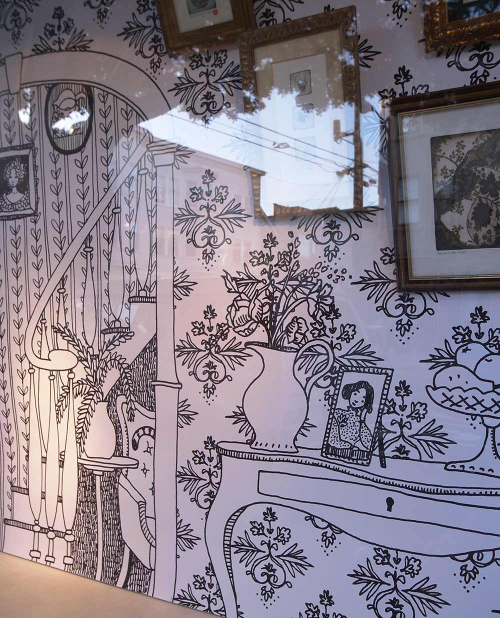 The framed pieces are etchings of ceramics and a portrait, echoing the subject matter within the backdrop. They're full of patterns, creating a layer of patterned artwork on top of patterned wallpaper.
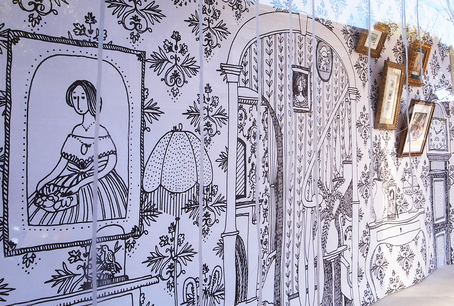 One of the difficulties was fighting the un-removable grafitti on the glass. By creating a detailed pattern, I hope I've managed to distract the eye!
Please go and take a look if you're around. It should be up for 2 months.
Laurie R. King
This week I went to Kepler's bookstore in Menlo Park to hear one of my favourite authors Laurie R. King talk about her new Mary Russell & Sherlock Holmes novel. She chatted quite informally with another crime writer, Catriona McPherson, and I sketched them as I listened. Afterwards I asked them to sign my sketchbook. What a wonderful evening!
Kung Hei Fat Choi!
year of the goat
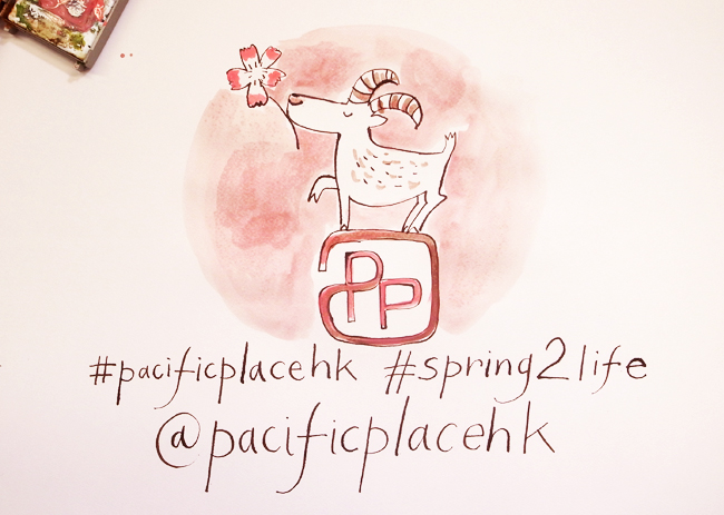
Here's a video of me drawing a happy new year goat. It was made as part of the social media campaign for Pacific Place mall in HK. It's a visual pun on a traditional Chinese blessing about the rabbit's breath and the goat's eyebrows, which somehow translates to good fortune! https://vimeo.com/119728675
I did pencil sketches first to work out the order in which to draw things, how the goat should look, and the positioning of drawing and text. This is how the final goat looks in ink and watercolour...
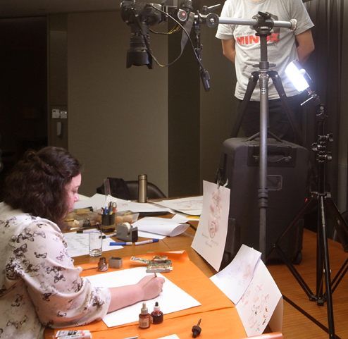
 And this is the filming. I drew at my normal speed, but tried to keep it generally consistent, and the final footage was speeded up, and a soundtrack added. I've never done this before, but it was fun!
Pacific Place
I've just arrived in HK to do some promotional work for Pacific Place luxury shopping mall. I created an illustration about the celebration of Spring, for their Chinese New Year decorations. I used red (a lucky & auspicious colour) and included all the 12 Chinese horoscope animals. It also features Chinese New Year elements such as peonies, plum blossoms and pine trees.
The PP website features the design in a pink + brown colour combination.
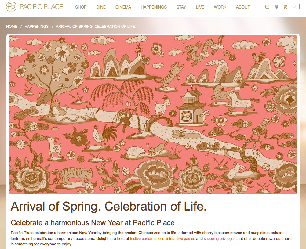 There'll be all kinds of fun events at Pacific Place over Chinese New Year, so if you're around, please check it out! I'll be taking some photos of the decorated mall this week, so you can see those soon.
It's the year of the goat, and I especially do like drawing goats...
Sicily map
I haven't featured any maps recently, so I thought I'd show this map of Sicily I did for Conde Nast Traveller in the UK . I painted it a while ago, and I like the way it's placed in the page, giving it lots of room to breathe. I also thought I'd show my rough sketch for the map:
 You can see how the outer shape of the sea around the island has changed, and a few things, like the distance scale, have moved, and that I removed all the tiny outer islands. The final map became more streamlined, and focussed on the important elements. The bright Mediterannean colours were wonderful to paint.
flowers
Victoria and Albert museum
happy Christmas!
Waitrose Christmas
For this year's Waitrose Christmas magazine in the UK, I drew images that would be used as backdrops for the hampers special photoshoot. I created the illustrations, but as I couldn't be on location, a specialist did the physical chalk drawings onto boards on my behalf. I think they turned out pretty well!
 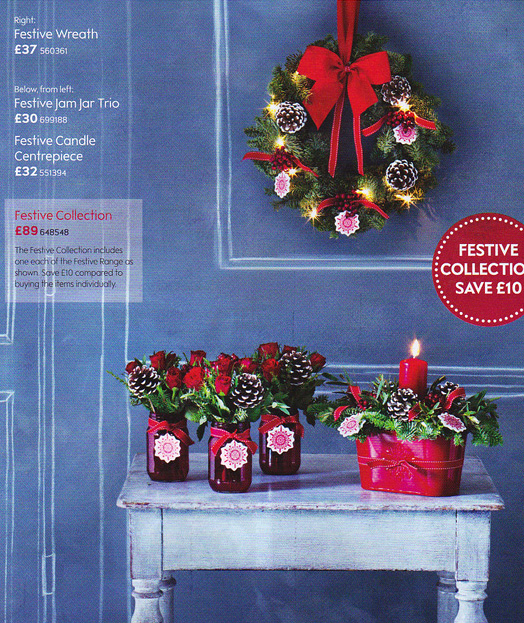 Pick up a copy in any Waitrose to see them all!
WOM dining guide
I worked on the new WOM dining guide in HK, and I really like the glossy brightness of the cover. I created an illustration about food and drink in HK, and managed to feature all my favourite buildings. As this issue is about award-winning dining, I drew all sorts of badges and awards inside, for the different categories.
 The awards were also given to the actual restaurants, and it was great to see this on display!
Thanksgiving!
Thanksgiving is this coming week here in the States. Every year it falls on the 4th thursday of November and everyone goes to see their families and have a huge turkey meal, and think about all the things they're thankful for. I'm thankful for having such a lovely husband, wonderful family, excellent friends, and for being able to draw every day. I hope you all have lots of things to be thankful for too...
Hearst Castle & Monterey
We visited Hearst Castle last weekend, which was totally enshrouded in fog and completely crazy. It was fantastic to walk through the rooms and marvel at the mismatched objets... I liked the details in the carvings and sculptures...
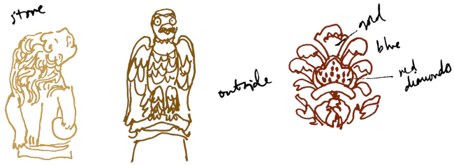 and I really loved the vintage phones in all the rooms!
 On the way there we drove down the Monterey coast along Big Sur.
 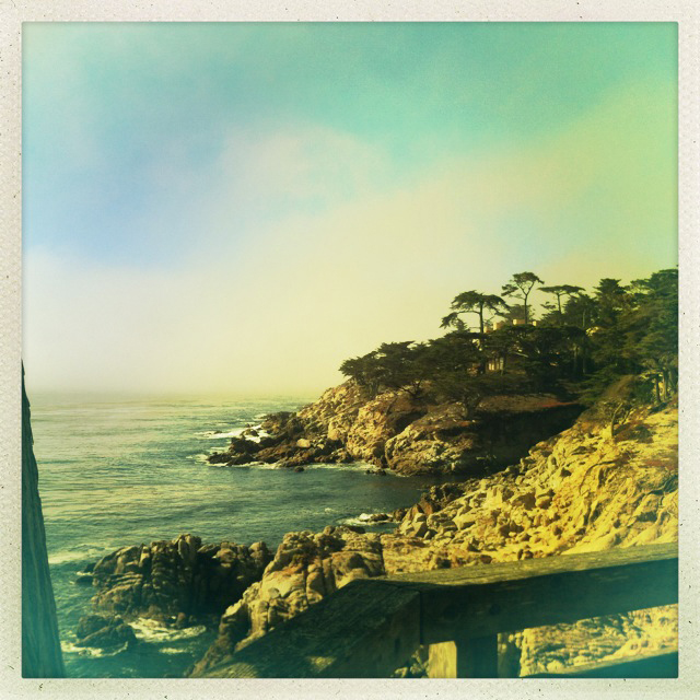 It was absolutely beautiful. We cruised '17 Mile Drive' and looked at the famous lone cypress and saw sealions and dolphins, hurrah!
Washington Flyer
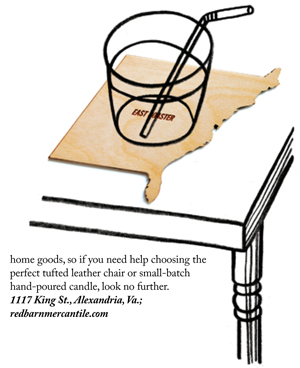
I did some nice grainy line illustrations for the magazine Washington Flyer this month. It's their holiday gift special...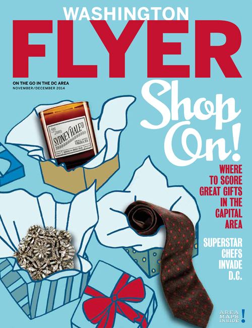 You can see the full issue here.
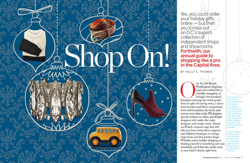 It was fun to design the wallpaper pattern, and also fun to start thinking about Christmas. I love the holiday season!
River Cottage light & easy
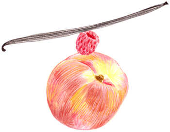
I illustrated Hugh Fearnley-Whittingstall's new cookbook, which is available now, and it's lovely! The recipes are totally amazing, especially when you realise that they're gluten & dairy free.  My illustrations throughout the book are drawn in colour pencil, so I could make them feel 'light and easy'...
  I did some little drawings to add flavour to the page...
 and some larger ones across whole spreads.
 I did some drawings around the text...
 and some for the text to go around.
 I worked with the whole Bloomsbury team, as well as Hugh, but mostly with the wonderful Lawrence Morton, who art directed the book.
There is now a River Cottage youtube channel, where they feature quite a few recipes from this book. Take a look, it's really fun!
River Cottage light & easy is available from River Cottage's amazon page. And of course all good bookstores. Enjoy!