I've recently done a little bit of work for the nice people who run Talaramba Reef holiday villas in Sri Lanka: I did some calligraphy for their logo and website, I created little icons of local flora and fauna for the website & for use inside the villas,
 ![]() and also created a map of their location.
and also created a map of their location. I think it must be holiday time very, very soon...
illustration
sketchbook project
I joined a community sketchbook project run by the Art House Co-op in Brooklyn, NY last year, and recently completed my book for the 2012 project.
I chose the subject 'forks and spoons' and researched folklore, sayings, and proverbs from all over the world concerning cutlery. I experimented and doodled in the sketchbook in a variety of media, including collage. 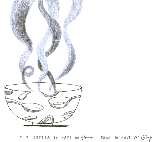

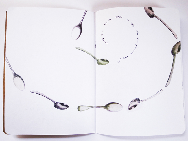 All the sketchbooks in the project will be going on tour around the States, before they're permanently archived in Brooklyn. Please keep a look out and see if they're going to be near you. I'd love to hear from you if you see my sketchbook!
ceramics press clippings
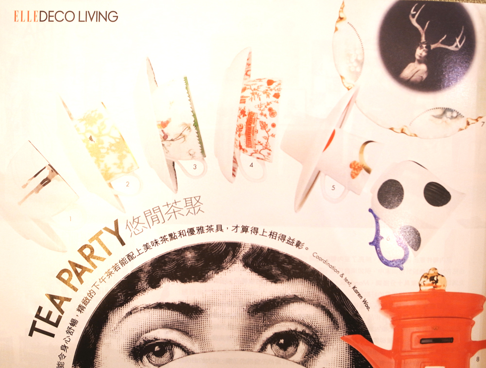
My HK toile teasets have been getting a lot of press in Hong Kong recently, thanks to kapok in Wanchai, where you can buy all the ceramic pieces in both colours...

happy new year!
happy christmas one and all!
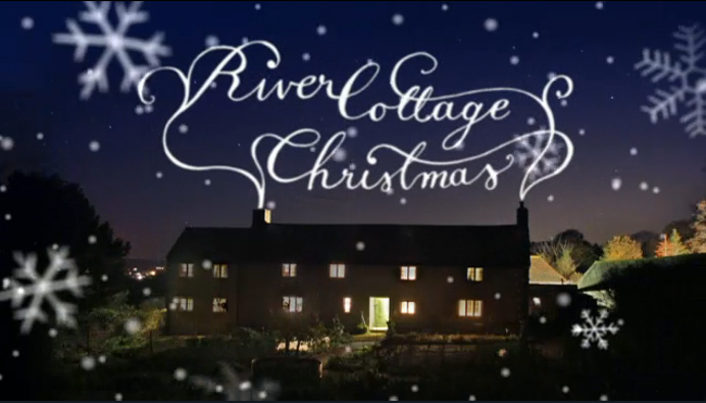
River Cottage Christmas
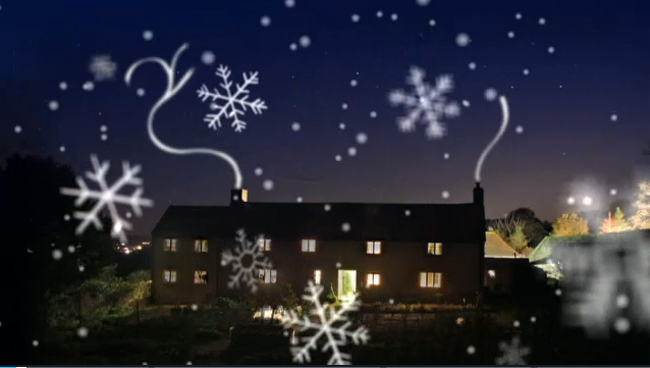
I did the illustrations for the recent one-off special episode 'River Cottage Christmas'. My drawings were animated in a cosy wintery way. You can see the episode on catch-up for a few weeks here.

Middlebury college Christmas animation
I did the drawings for a special Christmas Season animation by Middlebury College. My white line drawings were animated with a fun, wobbly movement, over the students talking about the winter at college in Vermont.
You can see the animation here. 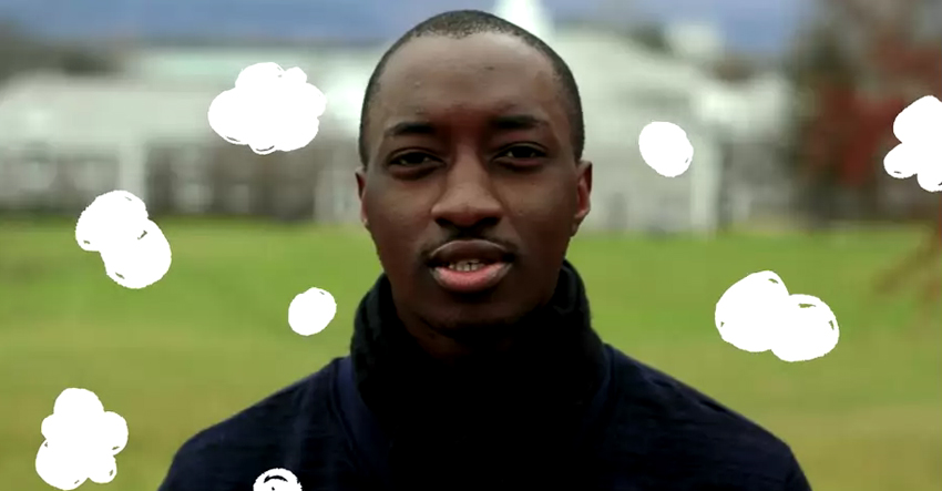


Lane Crawford gift cards
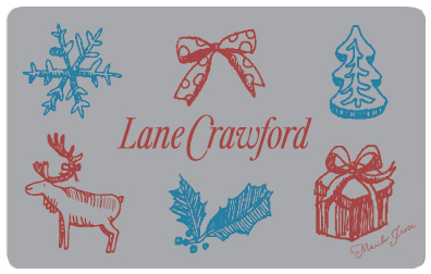
I've designed some festive season, electronic gift cards for Lane Crawford, the exclusive luxury department store in Hong Kong. They are the latest in their 'artist series'. There are three designs to choose from, the first is a simple reindeer on a metallic aqua background, the second is a selection of winter holiday sketches on silver...
 and the third is a special Christmas gold and red version of my HK toile...
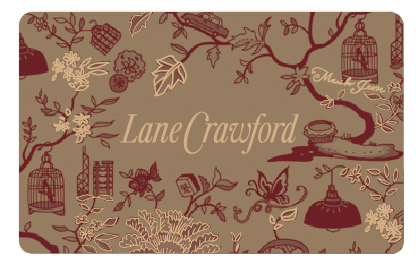 (You can still buy the toile teasets at Lane Crawford by the way). Happy Christmas shopping!
charity christmas cards
I've designed a range of christmas cards this year for ndi moyo, a charity that provides palliative care for HIV/AIDS sufferers in Malawi. 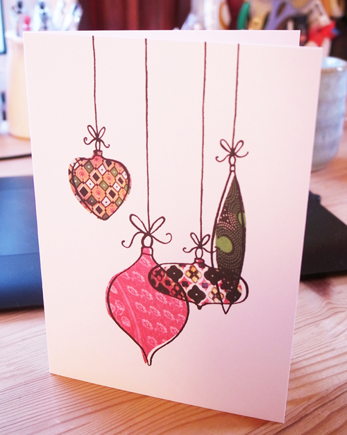 Here are some of my favourite designs. I based them all around traditional Christmas themes of baubles, gifts and trees, using African textiles and patterns to reflect the locale of the charity itself.
 I've done five designs, which you get in a mixed pack of twelve cards (six cards by another illustrator) with envelopes. Unfortunately you can't buy just my designs, but it all goes to charity, and the other cards are pretty interesting too!
If you're thinking of getting your christmas cards soon, I hope you'll consider buying these...
just a minute
I went to a recording of 'Just a Minute' (my favourite radio show ever) last week, at BBC Broadcasting House in Portland Place, London. We had to wait in line for a long time, but it was worth it.
Nicholas Parsons was jovial and dressed smartly in his usual stripy blazer, the panel was almost ideal: Paul Merton was droll, Jenny Eclair sharp, Ross Noble a bit obscure and crazy, and Gyles Brandreth was totally OTT. I loved it!
I used to listen to the show with my dad, when I was a child in HK, when it was broadcast on the world service on sundays. When we moved to the UK when I was 12, dad and I went to a live recording with all the original panel: Kenneth Williams, Derek Nimmo, Clement Freud, and my favourite, Peter Jones.
It was so amazing to see another recording, so many years later. Nicholas Parsons is still the chairman, and has been for the whole of the 45 years it's been going! Amazing...
iriya plus cafe mural
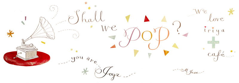
While I was in Tokyo two weeks ago, I went to visit my friend Naomi who runs iriya plus cafe, in Iriya, near Ueno. It's in an old warehouse building that she renovated, keeping the gorgeous original wooden beams and shelves, and overall traditional Japanese style, but adding a modern feel.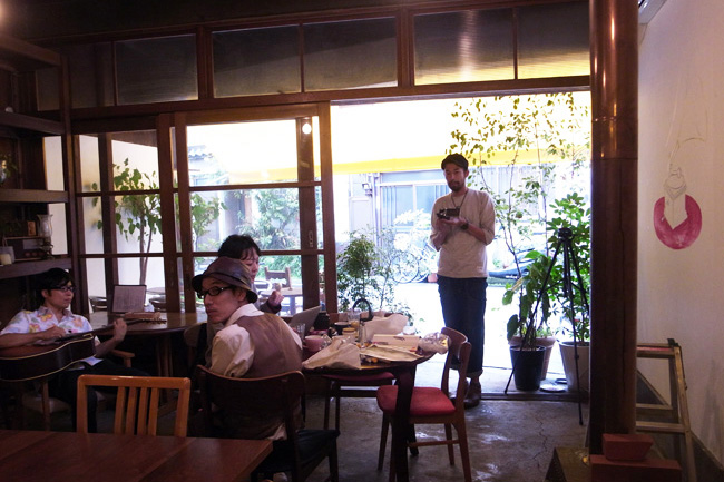 She commissioned me to paint a mural on the main cafe wall, as a backdrop for the upcoming 'pancake party' event, with live music by the local band JOYZ (you can see them in the above photo).
 I drew this initial rough design, but found out that they don't make pancakes in a frying pan! So I took the pancake out and added more text. I also changed the font I used for 'POP' into my more comfortable calligraphic stye. Here's how it looked when it was done.
 A photographer called Takumi Yamamoto, a friend of JOYZ, documented the day: me doing the mural, and also JOYZ playing live while I was doing the painting. There was a typhoon that day, but we were all snug inside.
  This is everyone, including the cafe staff...
If you're in Tokyo on October 29, try to make it to the live event, I bet it'll be fantastic. For tickets and more details, go to the iriya cafe blog. Wish I could be there!
Kate Spade party
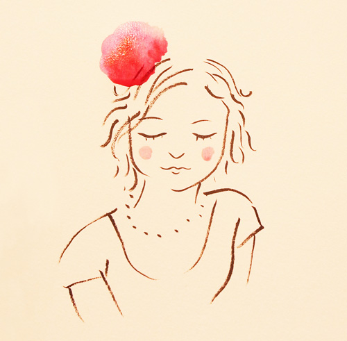
Kate Spade has just opened a shiny new store in Pacific Place shopping mall in Hong Kong, and I was asked to be a guest artist at the opening party. I drew sketches of the customers and VIPs (who had each been given a fabric flower to wear for the event), and gave them to everyone to keep as a souvenir gift. It was fun! I kept the portraits light, pretty, and in the style of the evening. Each one had a dash of watercolour red and pink for the flowers, and took under five minutes to complete. I think most of the guests were happy with their pictures...
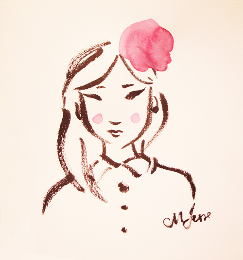 I had expected it to be mostly women, but alot of men sat for me also, which was great.
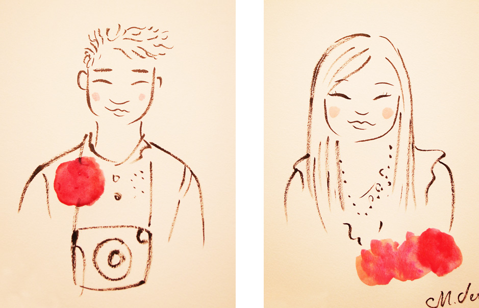 There were a few local celebrities there, and I even drew a portrait for Stephy, a canto-pop singer.
 Check out all the HK stores (ifc, Harbour City & Elements, as well as PP) if you're into super nice handbags and accessories!
Stephan Said album artwork
In my last NY blog I mentioned that I went to a gig of a friend of a friend (Stephan Said) and did some sketches... well, my friend showed him the sketches, he (Stephan) loved them, and asked me if I could do some more for his new album. So I did. We discussed the album, I watched videos of his live performances, listened to the songs, and then worked out a concept for the album cover: I drew each of the main band members, and the image wrapped around the front and back of the CD packaging to show them all.
 I did extra sketches for the inside of the booklet, and also did most of the hand-lettering in the same loose pen style, for the titles and track names. I think it holds it all together well.
Here's an interview with Stephan on PRI, and you can listen to the single 'Take a Stand' on the Huffington Post, and of course you can find out all about Stephan on his own website.
The album was released yesterday, September 21st, International Day of Peace.
River Cottage veg everyday!
My new book is out! I say my new book, but of course it's Hugh Fearnley-Whittingstall's new book: the next River Cottage everyday cook book, all about vegetables. Yum.  For this book, I created the illustrations out of the ingredients themselves: I printed with the actual vegetables in the recipes. Remember how you used to print with potatoes at school? Sort of like that, but in a slightly more professional way.
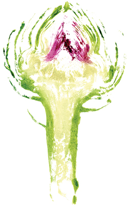 I left some of the vegetable prints simple (like this globe artichoke) and with others I created narratives and patterns, to complement the recipes.
 The illustrations have the same relaxed 'home-made' feel to them as the ones in the last 'River Cottage every day' cookbook, but this time in full colour, and with texture.
 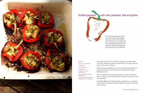 You can read what Hugh says about the book here:
http://www.guardian.co.uk/lifeandstyle/2011/aug/26/hugh-fearnley-whittingstall-vegetables
It's the Guardian link, as he writes for them every weekend. The book is on their best-seller list! You can also go direct to River Cottage to watch several videos of Hugh talking about the book. He's so excited about vegetables...
I'd also like to say a little thank you to Lawrence Morton, who art directed the book, as he's been so wonderful to work with. Thank you!
private view tonight!
monsters illustration show
As you may know, I'm part of an illustration collective in London called monsters and we sometimes get together and do projects as a group. We've got a show launching on sunday at a cycling-themed cafe/bar in Old Street.
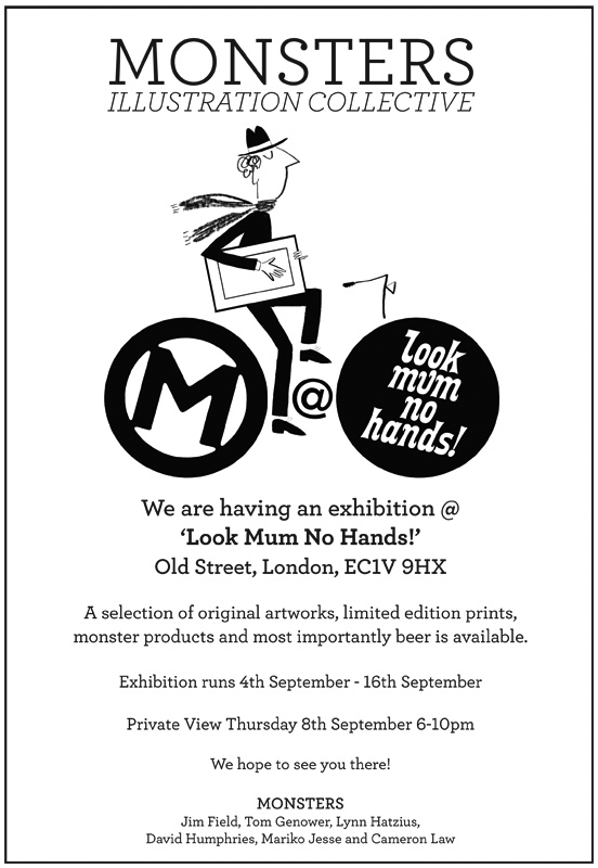 Everyone (except me, unfortunately I'm still away) will be attending the private view, so if you fancy meeting us, please join us on thursday evening. Otherwise, pop in any time to have a look at the wonderful work!
Here's a sneak preview of one of my new pieces done especially. It's a digital archival print, in an edition of 10.
Hope you enjoy the show!
connecting your world
Hello! I've just found out that an illustration I entered into the Cathay Pacific competition 'connecting your world' won a prize! I'm very excited. The competition was for images or text that showed how air transport connected Hong Kong to the world, in a creative and inspiring way, to celebrate the 100th anniversary of the first powered flight to HK in 1911.
My winning picture...
And the photo I entered, that didn't win, but that I still think is pretty good ...
award!
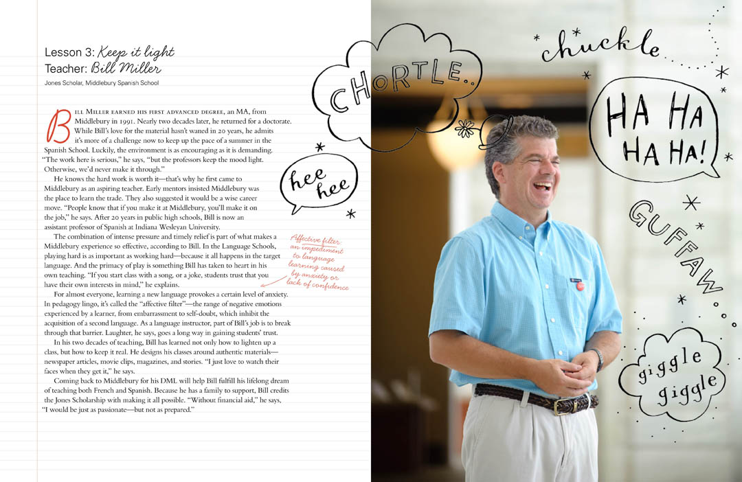
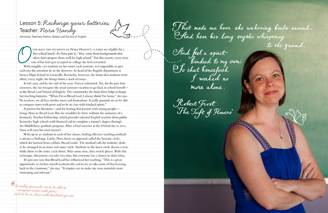
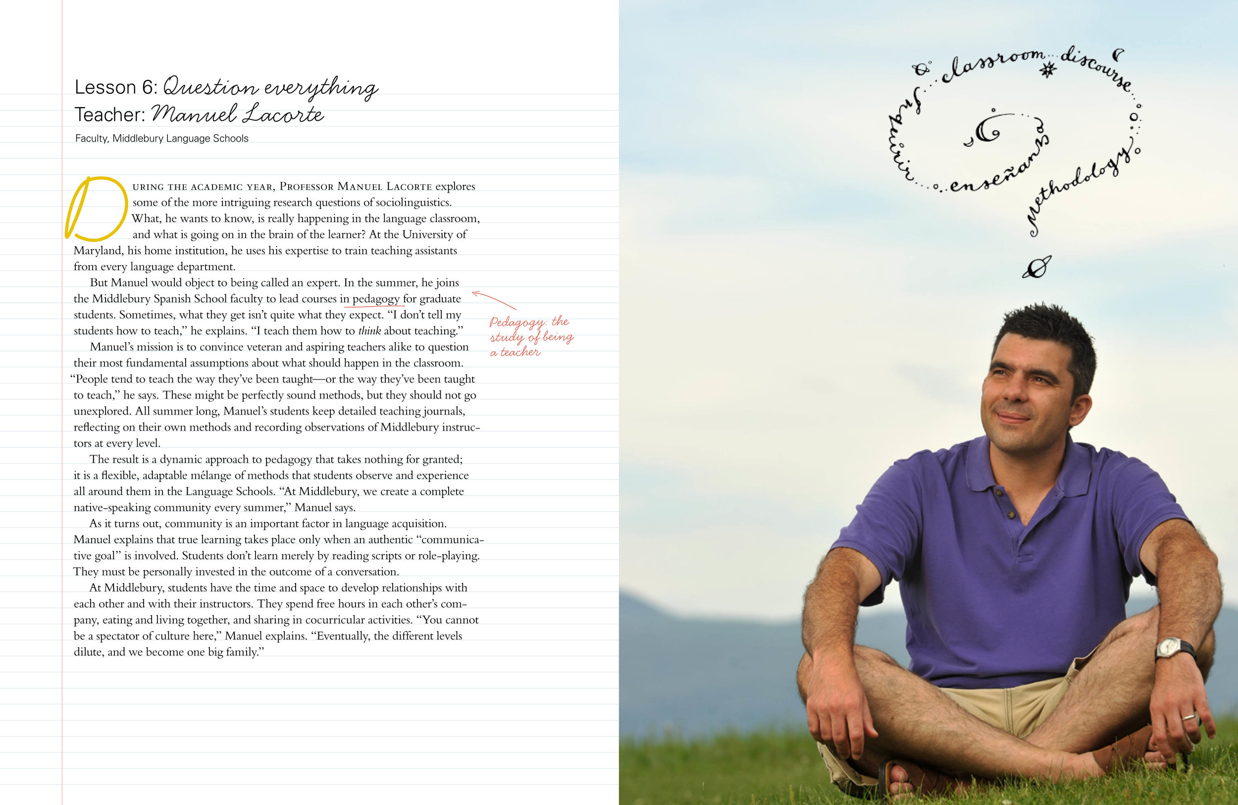
Finally, I win an award! Well, technically I didn't really, but I was part of the team that made the piece that won the award, so it's a good start... The UCDA (University and College Designers Association) in the US gave the 'Award for Excellence' for the Betty Jones 'Summer School' annual report I illustrated for Middlebury College. It was designed by Carey Bass, with photographs by Brett Simison.
With pen and ink line, I drew on top of various photographic portraits of teachers, highlighting what they thought about their experiences as educators. I really enjoyed this project, which just goes to show that sometimes the fun ones are the ones that really work.
wedding invitations
So, my good friend Ping got married this May, and I designed his wedding invitations, and also created a special map for him of Central Park in NY (where he made his romantic proposal). The style brief for the invitation was a vintage, country feel, with a quirky, hand-made aesthetic; light-bulbs hanging from wooden rafters and flowers in jam jars, that sort of thing.
I created a simple, hand-lettered invitation, in two slightly retro colours, with a few illustrative details. Inside, the card was also hand-lettered.

 The card design was used as a detail throughout the wedding, with cards on the tables as menus, place settings and memory cards, where everyone could write notes for the bridal couple and hang them up on a washing line...
The map I created for them was a narrative of where they walked that day, where Ping hesitated, where they got lost, and where he finally proposed.
 It was used as an animated feature in a mini-movie of the wedding, and also as a back-drop for the stage at the reception:
*the photographs were taken by Tec Petaja
