I designed some thank you cards that matched our wedding Save-the-Dates and invitations, to send our lovely guests. The illustration features the watercolour leaves from the wedding, but small pink flowers have been added to the design, to show love blossoming...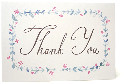 The leaves were printed in HK (my friend Sandy at Lui & Co handled this for me) on specially chosen thick soft paper, and these were then sent to my friend Katie Baldwin in the States, who letter-pressed my calligraphy and flowers by hand.
  This created the effect of softness and crispness, in one beautiful package. I hope it's a special way to thank everyone who shared our wedding, and those who sent us gifts from far away...
my birthday!
It was my birthday this week, and I spent it in San Francisco. I went to the Asian Art Museum to see the Japanese art exhibition, and admired some lovely ceramics (this is a birthday peach from a Chinese plate), and some Japanese sculptures and painted screens.
 I walked through the civic centre and then on to the Hayes Valley to look at some pretty boutiques...
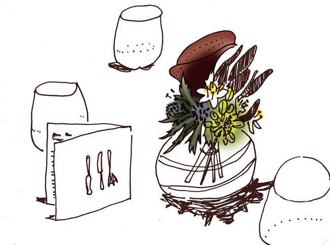
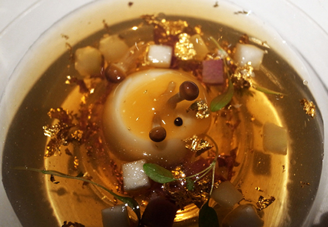
 ...and then in the evening we went to Sons & Daughters, a lovely little restaurant in Nob Hill. The service was delightful, the food exquisite. I drew each dish in the tasting menu as it came out...
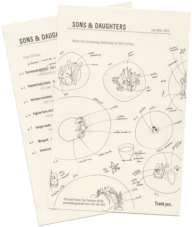 and took some photos of the colours and presentation. Yum in every way.
BEYØRG
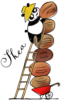
I worked with organic cosmetic company Beyørg (Beyond Organic) in HK this year, to create images they could use on promotional products, supporting the Breast Cancer Foundation charity. I drew pandas (cutest of all Asian animals) interacting with various ingredients from the cosmetics, such as acerola fruit, ginseng root, and white lupin flower. The illustrations also featured a farm element, as the client wanted to emphasise organic farming. I tried to make the pandas cute, but not too cute. They were used on packaging, and promotion for the brand.
 I created a repeat pattern with the pandas along with some extra elements, and this was used on a patterned white umbrella. I love it!
  The umbrella is a limited edition gift item for customers in the shop, and will only be available until the end of August. There's also a cuddly panda...
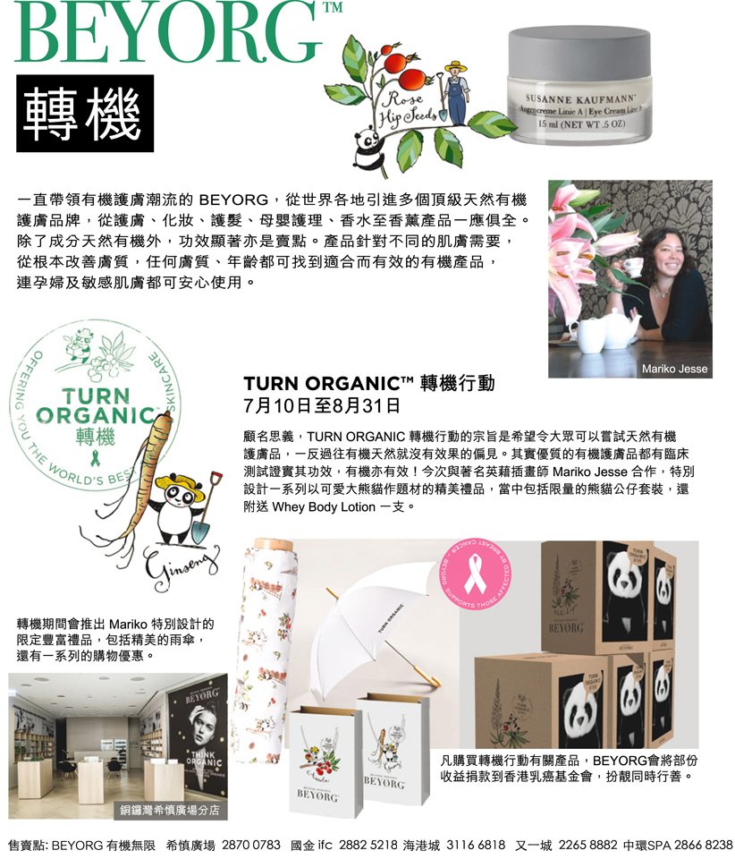 The products have been featured in various local magazines, along with a little about me. How nice!
London toile
My London toile collection launched this week. There's a teaset with a perfectly pouring teapot... and I love these wider teacups and saucers, perfect for afternoon tea with a cucumber sandwich.
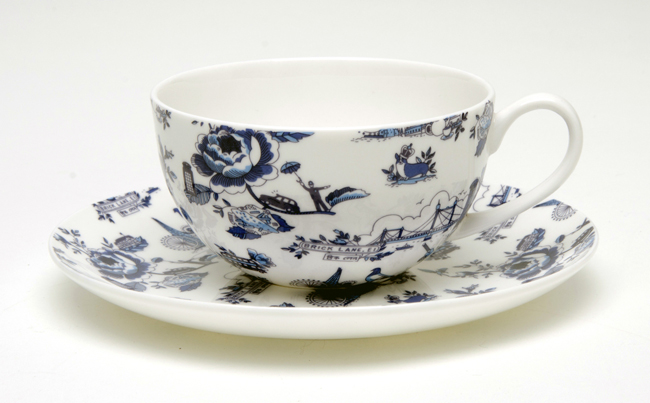 The design is in blue, and made up of all my favourite London things: phone boxes, bobbies, corgies, fish & chips, teatime cakes, cabs, the Albert Hall, and more! I tried to include a few things that you might only get to know if you spent a little time there...
 There are also napkins and teatowels featuring the toile, and coming soon, some fun dinner plates. They are currently available exclusively at faux in HK. If you know someone who might like to sell them in London (ideal, really), please let me know!
Fish Market cookbook
I've done some illustrations for Running Press in the States, for a book about how to choose, buy and prepare seafood. The cover looks like a market blackboard with chalky lettering and illustrations of today's catch.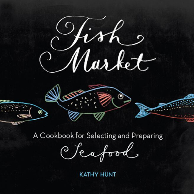 The drawings for the inside pages are pen and ink line. They were used reversed out for the inside cover.
 Inside I did drawings of each individual fish.
 There are also instructional illustrations, showing you how to do various prep things...
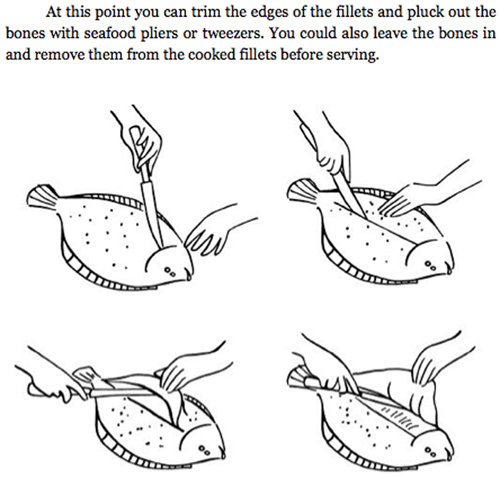 If you're into seafood, I think this would be a great book to have! It's available from amazon.
Juri's Cotswolds tea shop
I did some work recently for a lovely little teashop in Winchcombe in the Cotswolds called Juri's. I did a hand lettered version of their original script font for their logo rebrand, and added a classic typeface for their house font.  I created 4 watercolour and pen illustrations for their home-blend tea pack labels, basing the illustrations on the blue and white china they use, and the delicious cakes and jam that Juri makes.
  There's a dotted line at the bottom of each label, for Juri to write in the particular blend of tea in the pack by hand.
 I also added one of the teacup illustrations to their shop information card. If you fancy a delicious cake and cup of tea, this is the perfect place...
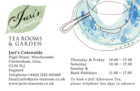 I worked with my dad Nick Jesse on the layout and type for the project.
mindful magazine
I recently did some illustrations for mindful magazine in the US, and have just received a copy of the current issue. My illustrations are delicate calligraphic line drawings in white, over photography.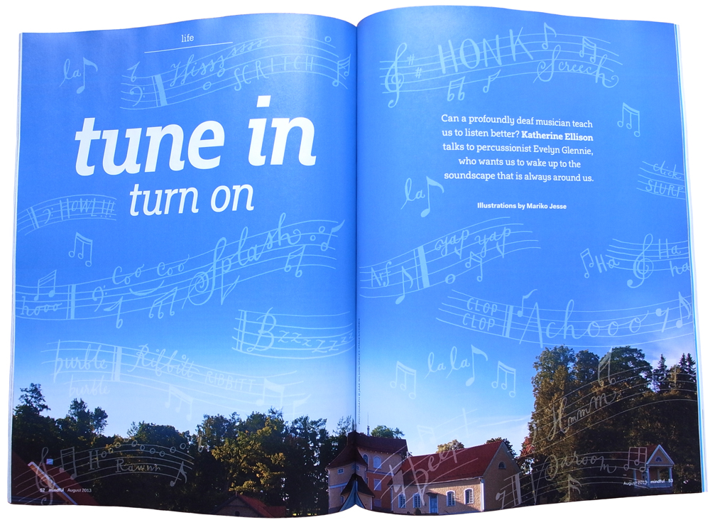 The article was about listening out for everyday sounds. I tried to listen, and capture those little noises that I usually don't hear.
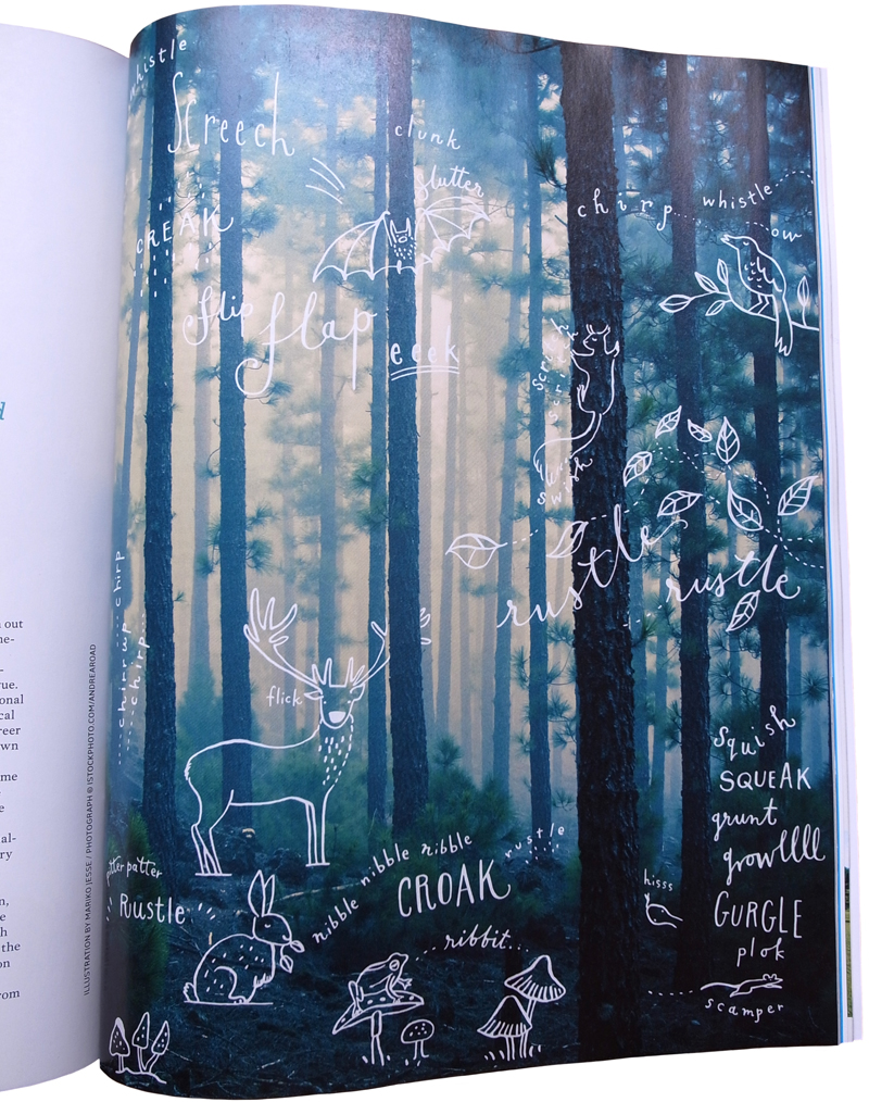 I really enjoyed doing different sorts of lettering to match the kinds of sounds.
 They also featured a little sketch and mini interview with me on their contributor's page...
horus
wedding loveliness
Designing and illustrating for my own wedding has been a pleasure. Stressful, but full of joy too. I created all the stationery first, with a green/pink/brown/white colour palette, and occasional border of green watercolour leaves, and then carried this through all the wedding elements. Simplicity was the key to everything.
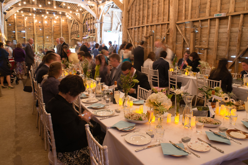
 The reception was held at the Black Barn, in Berkshire (UK), a huge barn on a working farm, and a delightful setting for a perfect day. They don't have many weddings there, and I was free to create everything just how I wanted it...
 My brother Kenji was in charge of the bar (he's a drinks specialist) and he created a welcome punch for the guests, with watermelon hearts on the glasses, and special cocktails for the evening.
  I made the signage for both in the wedding colours.
 My friend Karen made bunting out of different shaped paper doilies and green ribbon, which we hung inside and outside the barn. I had lots of fun with the flowers, which I bought from New Covent Garden market and arranged with my mum, in my personal collection of vintage bottles, jars, and white ceramic jugs.
  The interior of the barn still takes my breath away. I wanted it to be pretty, welcoming, and sparkling, and retain the essential "barn-ness" of the venue itself. To create a glowing atmosphere, I used festoon lights for the ceiling, hung by the amazing James and Chris of acdisco, and smaller pinlights from thinkgadgets for the columns. My friend Alvin, of YMK design, oversaw all the technical aspects of the styling and installation.
 I painted the seating plan as vines with leaves, in the U shape of the table layout.
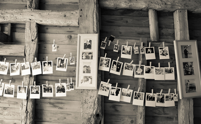
 In the entrance to the barn, photos hung on twine with wooden pegs (along with some framed photos of the bride & groom). Alvin took fun photos at the wedding with a mini polaroid camera, and these were also hung up for everyone to see.
 On the opposite side of the entrance was the centre-piece of the reception: the cake table. Friends brought hand-made cakes, meringues and puddings, and my friend Anna styled the table to look irresistible.
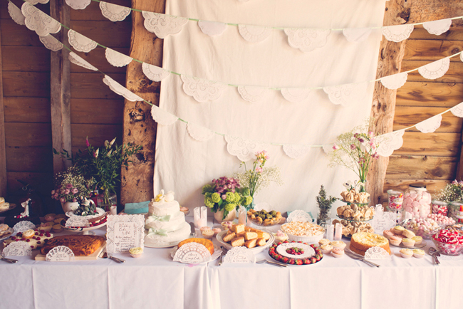 I made hand-written doilie labels for the desserts, with the baker's name, aswell as the type of cake. I also made doilie candles in various heights, containing battery-operated tealights, for all the tables. Our official photographer Sonja Read took these beautiful photos of the cake table.
 My dad made our gorgeous wedding cake; three tiers of homemade fruit cake heaven...
 At the end of the cake table was a mini sweet shop. Everything came from my favourite treat website, Chorley & Baker. We had sugared almonds, milk bottles, gummy hearts, and apple bon-bons, all chosen with the wedding colours in mind.
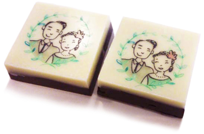
 My friend Alex at ChocoYou even made delicious little hand-made chocolates with an edible version of my vignette illustration on them!
 My dad also made some lovely wine bottle labels, using elements of my illustrations. Each label had a portrait of us, and a quote about love.
 The amazing Street Kitchen provided the catering. They parked their airstream just outside the barn, and everyone went up to collect their food. For the main course, I used eco-friendly plates that matched the barn, that we could recycle,
 and for the desserts, I gave each guest a personalised vintage side plate. They doubled as place settings and wedding favours, and were such fun to make.
 I bought plates from Portobello market, thrift stores in San Francisco, and charity shops all over London, and then created a dotty calligaphy font in ceramic paint, which could be baked on, to become permanent.
 It was our dream wedding, and I'd like to thank everyone who helped us with all the planning, designing, installation and clean-up (especially Johan, our wonderful DJ friend). It simply wouldn't have been possible without the help of all our friends and family.
Everything was perfect, and I'm full of love for all of you...especially my adorable new husband.
honeymoon in Andalucia
I've just come back from a lovely honeymoon in Spain. We did nothing much, and watched the world go by. We stayed for a week in a pretty cottage on the side of a hill full of olive groves,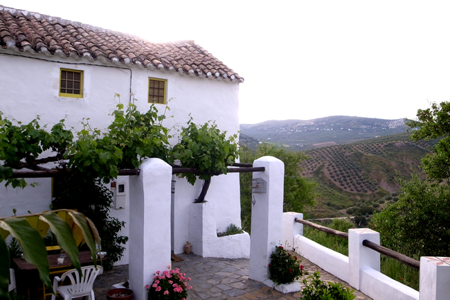 then another week in the village of Bubion in the Sierra Nevada mountains.
  We had a delightful garden overlooking the valley, and on good days, we could see the Meditarranean and even the mountains of Africa!
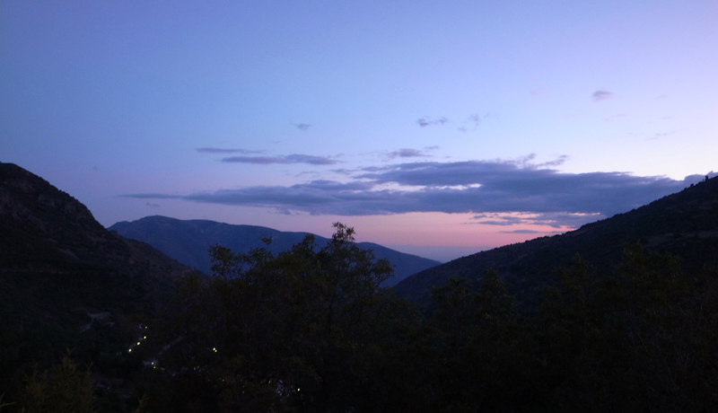 There was one amazing day when the whole mountain was in the clouds, and everything looked a bit spooky and mysterious.
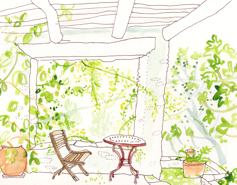
 I loved the greenery all around us, and started imagining my dream garden, full of fig trees, ferns, moss on the stones, and hanging roses...
 We also visited the Alhambra in Granada. It was wonderful to wander in the gardens, and explore the palaces. I especially liked the variety of mosaic tiles in all the rooms.
 Afterwards we sat in the late afternoon sun, and watched the walls of the Alhambra slowly changing colour.
wedding detail
There are so many things I'd like to show from my wedding, but for now, here's a photo of the ceramic wedding cake topper that my friend Aude made for us. I love it so much!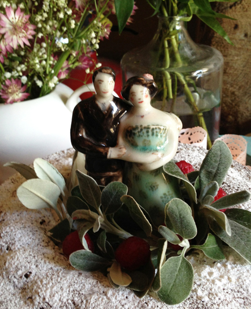 I'm away on honeymoon for two weeks, and when I get back, I'll blog lots of gorgeous wedding stuff...
wedding (mine!)
I'm getting married tomorrow, hurrah! Here's our Save the Date. I kept to a simple colour palette of greens, pinks and browns, on white. This runs through all the stationery and the decoration at the reception. We're having a Quaker wedding, so I drew two of the founding members for the invitation,
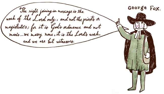
 and a little vignette of me and my fiancé for the cover.
 Congratulations us, happy days!
Hugh's veg book in German
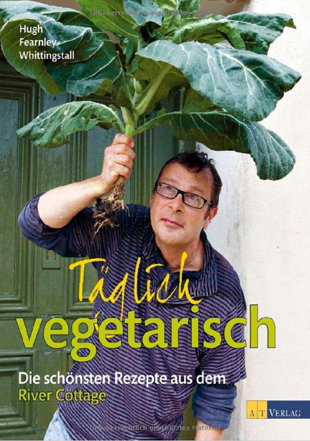 Hugh Fearnley-Whittingstall's River Cottage veg book has just been published in German. My illustrations are still nice and veggy, and I love the new cover photo!
Top Hat
I went to see the wonderful musical Top Hat in London for the second time last week. I totally adore this musical! It's old timey, simple, and just plain amazing. I have a soft spot for tap dancing, I have to say... The feather dress is my favourite in the show, but of course you can't beat the good old top hat and tails.
pies
I love pies! In case you hadn't already realised. I was thinking about pies the other day, and suddenly remembered a lovely little job I did for Parade magazine in the States, all about pies... The article was all about American pies, their history, which ones are famous, and what's so great about them (everything!)
First Merit Bank adverts 2
The hand-drawn animated TV adverts I did for First Merit Bank with Brokaw in the US last year were so popular, they asked for more! And here they are. Enjoy!
San Francisco
Conde Nast Traveller map
the Fat Duck
We went to Heston Blumenthal's The Fat Duck restaurant the other day. It was an experience and a half! My very first 3-starred Michelin restaurant.  When food looks as exquisite as this, it's impossible to resist...
framed teapot print
Here's a nice photo from kapok, advertising their hanging lights. It's got my blue Peony etching in a pretty white frame on the right hand side!
